Poor headings turn your content into a wall of text that readers abandon within seconds. Most content creators and bloggers struggle with organizing their ideas in a way that keeps readers engaged and helps them find exactly what they need.
This guide shows you how to use headings for better readability and transform your content into something people actually want to read. You’ll discover how proper HTML heading structure creates a clear roadmap for your readers while boosting your search rankings.
We’ll cover how to master the six-level heading hierarchy that gives your content a logical flow, plus the visual design principles that make your headings pop off the page and guide readers naturally through your ideas. You’ll also learn advanced formatting techniques that separate amateur content from professional work that gets shared and remembered.
Understanding the Power of Strategic Heading Structure
How headings act as roadmaps for your readers
Think of your content like a busy city. Without street signs and clear directions, visitors get lost and frustrated. Headings work the same way for your readers – they provide essential navigation that guides people through your ideas smoothly and efficiently.
When someone lands on your page, they don’t read every single word from start to finish. Instead, they scan for what matters most to them. Headings for better readability create clear pathways that help readers jump directly to the information they need. This scanning behavior isn’t laziness – it’s smart reading in our information-rich world.
Well-structured headings also set expectations. When readers see a heading like “5 Quick Solutions,” they know exactly what’s coming next. This predictability builds trust and keeps people engaged with your content longer.
The science behind scanning behavior and attention spans
Research shows that most people scan web content in predictable patterns. The famous F-pattern study revealed that readers typically focus on headings first, then scan down the left side of the page looking for entry points into the text.
Your readers make split-second decisions about whether to stay or leave based on how easily they can improve content readability with headings. Studies indicate that people form opinions about web pages within 50 milliseconds – faster than the blink of an eye.
Modern attention spans average just 8 seconds for initial engagement. During this crucial window, headings serve as the primary tool for capturing and directing attention. When headings clearly communicate value and structure, readers feel confident that investing their time will pay off.
The brain processes structured information more efficiently than dense blocks of text. Semantic headings trigger different cognitive responses, helping readers categorize and remember information better. This neurological advantage translates into higher comprehension rates and better user experiences.
Why proper hierarchy increases engagement rates
HTML heading structure isn’t just about making your content look pretty – it directly impacts how long people stay on your page and how deeply they engage with your message. Proper heading hierarchy creates a logical flow that feels natural to follow.
When you establish clear levels of importance through your headings, readers can choose their own adventure. Some want the complete story, while others need just the key points. Headings hierarchy accommodates both reading styles effectively.
Analytics consistently show that pages with well-organized heading structures have:
- Lower bounce rates – People stick around when they can quickly find relevant information
- Higher time on page – Clear navigation encourages deeper exploration
- Better social sharing – Content skimmability makes it easier for people to understand and share your main points
- Increased return visits – Readers remember and return to content they can easily navigate
Headings for UX also improve accessibility for screen readers and assistive technologies. This inclusive approach expands your audience while boosting search engine rankings. Search engines use heading structure to understand your content’s organization and relevance.
The psychological impact runs deeper than convenience. When readers encounter readable headings for web content, they feel respected and valued. You’re acknowledging that their time matters and making their reading experience as efficient as possible. This consideration builds stronger connections between you and your audience, leading to higher engagement and loyalty.
Mastering the Six-Level Heading System
When to use H1 tags for maximum impact
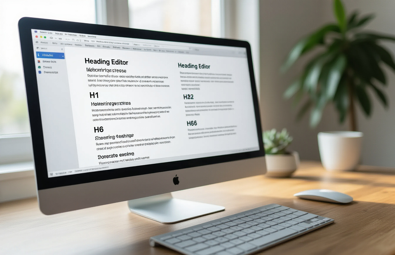
Your H1 tag serves as the main headline of your content, and you should only use one per page. Think of it as the title of a newspaper article – it tells readers exactly what they’re about to discover. The H1 creates the foundation for your entire HTML heading structure and sets expectations for everything that follows.
Search engines treat H1 tags as primary indicators of your content’s topic, making them crucial for SEO performance. Place your most important keyword naturally within your H1, but avoid keyword stuffing that makes the headline sound robotic. Your H1 should be compelling enough to hook readers while clearly communicating your content’s value.
Keep your H1 concise – aim for 20-70 characters to ensure it displays properly across different devices and search results. Make it specific rather than vague. Instead of “Marketing Tips,” try “7 Email Marketing Strategies That Double Open Rates.”
Creating logical flow with H2 and H3 subdivisions
H2 headings break your content into main sections, creating natural stopping points that improve content readability with headings. Each H2 should represent a distinct topic or argument that supports your H1. Readers often scan these headings first to determine if your content matches their needs.
H3 headings work as subsections under each H2, diving deeper into specific aspects of the main topic. This creates a logical hierarchy that mirrors how people naturally organize information. For example:
- H2: Social Media Marketing Strategies
- H3: Creating Engaging Visual Content
- H3: Optimizing Posting Times
- H3: Building Community Engagement
This structure helps both readers and search engines understand your content organization. The semantic headings create clear pathways through your information, allowing readers to jump to sections that interest them most.
Advanced techniques with H4, H5, and H6 headings
Most content creators rarely venture beyond H3, but H4, H5, and H6 headings can add sophisticated organization to complex topics. Use these deeper levels sparingly and only when your content genuinely requires such detailed subdivision.
H4 headings work well for breaking down processes into steps or listing specific examples under broader categories. For instance, under an H3 about “Email Subject Lines,” you might use H4 headings for “Personalization Techniques” and “Urgency Triggers.”
| Heading Level | Best Use Case | Example |
|---|---|---|
| H4 | Detailed steps or specific examples | “Step 1: Research Your Audience” |
| H5 | Sub-steps or supporting details | “Tools for Audience Analysis” |
| H6 | Granular specifications | “Setting Up Google Analytics” |
H5 and H6 headings should only appear in highly technical content, academic papers, or comprehensive guides where extreme detail serves your readers. Overusing these deeper levels can actually hurt readability by creating too many visual breaks.
Common mistakes that break heading hierarchy
The biggest mistake content creators make is skipping heading levels. Jumping from H2 directly to H4 confuses both readers and search engines. Your headings hierarchy should flow logically: H1→H2→H3→H4, like a well-organized outline.
Another frequent error is using headings based on visual appeal rather than content structure. Don’t choose H3 just because you like how it looks – pick the heading level that accurately reflects the information’s importance in your content hierarchy.
Multiple H1 tags on a single page dilute their SEO impact and confuse readers about your primary topic. Stick to one H1 per page, no exceptions. Also avoid using headings for styling purposes instead of structure. If you need larger text for emphasis, use CSS styling rather than heading tags.
Poor heading practices that hurt readability include:
- Creating headings that don’t accurately describe the following content
- Making headings too long or too vague
- Using headings inconsistently throughout your content
- Forgetting to optimize headings for content skimmability
These mistakes break the natural flow readers expect and reduce the benefits of readable headings. When done correctly, your heading structure becomes an invisible guide that enhances user experience and helps search engines properly index your content.
Crafting Headlines That Compel Readers to Continue

Writing Benefit-Driven Headings That Promise Value
Great headings act like mini-promises to your readers. When someone scans your content, they’re asking themselves “What’s in it for me?” Your headings need to answer that question immediately.
Think about the difference between “Website Security” and “5 Ways to Protect Your Website from Hackers in Under 10 Minutes.” The second heading tells readers exactly what they’ll gain and how quickly they can achieve it. This approach works because people don’t just want information – they want transformation.
Effective benefit-driven patterns include:
- How-to formulas: “How to Double Your Email Open Rates”
- Number-based promises: “7 Secrets That Will Transform Your Morning Routine”
- Time-specific benefits: “Cut Your Content Creation Time in Half”
- Problem-solution formats: “Stop Losing Customers with These Checkout Fixes”
Your headings for better readability should always connect features to outcomes. Instead of “Email Marketing Tools,” try “Email Tools That Convert Browsers into Buyers.” This shift makes your content more compelling and helps readers understand why they should keep reading.
Using Power Words to Trigger Emotional Responses
Power words tap into basic human psychology. They create urgency, curiosity, and emotional connection without being manipulative. These words work because they bypass rational thinking and speak directly to how people feel.
High-impact emotional triggers include:
| Category | Power Words | Effect |
|---|---|---|
| Curiosity | Secret, Hidden, Revealed, Behind-the-scenes | Creates intrigue |
| Urgency | Now, Instant, Immediately, Today | Motivates action |
| Authority | Proven, Expert, Professional, Master | Builds trust |
| Exclusivity | Exclusive, Private, Members-only, Insider | Increases perceived value |
Words like “ultimate,” “essential,” and “breakthrough” signal importance and quality. “Effortless,” “simple,” and “quick” appeal to people’s desire for easy solutions. When you improve content readability with headings that include these emotional triggers, you create a stronger connection with your audience.
The key is using power words authentically. Don’t promise “effortless” results if your content requires significant work. Match your emotional language to the actual value you’re delivering.
Balancing Clarity with Curiosity in Your Titles
The sweet spot between clarity and curiosity is where the magic happens. Too much clarity makes your headings boring. Too much mystery leaves readers confused and frustrated.
Clear headings tell readers exactly what they’ll learn: “How to Create a Budget Spreadsheet.” Curious headings tease without revealing: “The Money Mistake 90% of People Make.” The best headings combine both approaches: “The Simple Budget Mistake That’s Costing You Thousands.”
Strategies for achieving this balance:
- Start with clarity, then add intrigue: “Content Marketing Strategy” becomes “The Content Strategy That Doubled Our Traffic”
- Use specific numbers with mysterious benefits: “3 Psychological Tricks That Make People Read Every Word”
- Pose questions that promise answers: “Why Do Some Websites Convert 10x Better Than Others?”
- Mention common problems with solution hints: “The Email Subject Line Fix That Ends Low Open Rates”
When crafting readable headings for web content, remember that online readers are impatient. They need enough information to decide whether to continue reading, but not so much that they feel they already know everything.
Optimizing Heading Length for Different Platforms
Different platforms have different attention spans and technical constraints. What works perfectly on your blog might get truncated in search results or look cramped on mobile devices.
Platform-specific guidelines:
- Blog posts: 6-12 words work best for main headings, with subheadings staying under 8 words
- Social media: Keep titles under 60 characters for full visibility across platforms
- Email subjects: Aim for 30-50 characters to avoid mobile truncation
- Search results: Google typically displays 50-60 characters in title tags
For content skimmability, shorter headings perform better on mobile devices where screen real estate is limited. Long headings can break awkwardly across lines, making them harder to scan quickly.
The benefits of readable headings become especially clear when you test different lengths. A heading like “The Complete Beginner’s Guide to Understanding Advanced SEO Techniques That Will Transform Your Website’s Search Rankings” might work in print, but “5 SEO Techniques That Actually Work” performs better online.
Mobile optimization tips:
- Front-load important keywords
- Use action words early in the heading
- Test how your headings look on various screen sizes
- Consider how headings appear in your table of contents
Remember that headings for UX need to work across all devices. A heading that looks perfect on desktop but confuses mobile users will hurt your overall content performance.
Visual Design Principles That Enhance Readability

Choosing fonts and sizes that create clear distinction
The typography choices you make for your headings directly impact how readers navigate your content. Sans-serif fonts like Arial, Helvetica, or Open Sans work exceptionally well for digital headings because they remain crisp and legible at various screen sizes. These clean typefaces help readers quickly identify different heading levels without straining their eyes.
Creating a clear visual hierarchy requires establishing a consistent size progression between heading levels. Your H1 should be significantly larger than your H2, which should be notably bigger than your H3. A good rule of thumb is reducing each subsequent heading level by 3-4 points. For example, if your H1 is 32px, make your H2 around 28px and your H3 approximately 24px.
Font weight plays an equally important role in distinguishing headings from body text. Bold headings immediately signal to readers that they’ve reached a new section, improving content skimmability. Consider using semi-bold (600) for primary headings and medium weight (500) for secondary headings to maintain visual balance while preserving readability.
Strategic use of white space around headings
White space acts as a visual breath of fresh air, allowing your headings for better readability to truly shine. Proper spacing prevents your content from appearing cluttered and overwhelming, making it easier for readers to process information.
Above your headings, include 1.5 to 2 times more space than you place below them. This creates a natural association between the heading and the content that follows while separating it from the previous section. Most readers scan content vertically, and this spacing pattern supports their natural reading flow.
Consider these spacing guidelines:
- Above H2 headings: 32-40px
- Below H2 headings: 16-20px
- Above H3 headings: 24-32px
- Below H3 headings: 12-16px
Mobile devices require special attention to spacing. Reduce spacing by 25-30% for smaller screens to prevent excessive scrolling while maintaining visual clarity. Your headings hierarchy becomes even more critical on mobile, where screen real estate is limited.
Color and contrast techniques for better visibility
Color choices significantly impact how effectively your headings guide readers through your content. Dark headings on light backgrounds provide optimal contrast ratios, meeting accessibility standards while ensuring readability across different devices and lighting conditions.
Avoid using pure black (#000000) for headings, as it can appear harsh on screens. Instead, opt for dark grays like #333333 or #2c2c2c, which offer excellent readability without the stark contrast that can cause eye fatigue during extended reading sessions.
Brand colors can enhance your headings’ visual appeal, but use them strategically. Reserve your primary brand color for H1 headings or key section headers, then use darker neutral tones for subsequent heading levels. This approach maintains visual interest while ensuring your HTML heading structure remains functional.
| Heading Level | Recommended Color Approach | Contrast Ratio |
|---|---|---|
| H1 | Primary brand color or dark gray | 7:1 minimum |
| H2 | Dark gray (#333333) | 7:1 minimum |
| H3-H6 | Medium gray (#555555) | 4.5:1 minimum |
Test your color combinations across different devices and lighting conditions. What looks perfect on your computer monitor might appear washed out on a mobile phone or tablet. Tools like WebAIM’s Contrast Checker help verify that your semantic headings meet accessibility guidelines while maintaining visual impact.
Advanced Formatting Techniques for Professional Content
Creating Scannable Content with Bullet Points and Lists
Readers have become expert scanners, often deciding within seconds whether your content deserves their time. Smart formatting makes the difference between engagement and abandonment. Well-structured lists and bullet points act as visual rest stops that guide readers through your content naturally.
Transform dense paragraphs into digestible chunks using bulleted lists for benefits, features, or quick tips. Numbered lists work perfectly for step-by-step processes, rankings, or sequential information. The white space around these elements gives readers’ eyes a break while highlighting your most important points.
Consider these formatting strategies:
- Short, punchy bullet points that deliver one clear idea each
- Parallel structure across all list items for consistency
- Action-oriented language that tells readers exactly what to expect
- Strategic spacing between items to prevent visual crowding
Mix different list types throughout your content to create rhythm and variety. A combination of bullets, numbers, and short paragraphs keeps readers engaged longer than walls of text ever could.
Using Subheadings to Break Up Dense Paragraphs
Subheadings serve as signposts that preview what’s coming next. They create natural breaking points that make your content less intimidating and more approachable. When readers can quickly identify sections relevant to their needs, they’re more likely to stay engaged with your entire piece.
Break up paragraphs longer than 3-4 sentences with descriptive subheadings. Each subheading should clearly communicate the topic of the following section while maintaining logical flow throughout your piece. This approach improves content readability with headings by creating a clear information hierarchy.
Your subheadings should:
| Purpose | Example |
|---|---|
| Preview content | “Common Email Marketing Mistakes” |
| Ask questions | “Why Do Campaigns Fail?” |
| Promise solutions | “Quick Fixes That Actually Work” |
| Create urgency | “Don’t Miss These Deadlines” |
Strategic subheading placement transforms intimidating blocks of text into manageable, scannable sections that respect your readers’ time and attention spans.
Incorporating Keywords Naturally Without Keyword Stuffing
Modern readers instantly recognize forced keyword insertion, and search engines penalize obvious stuffing attempts. The key lies in weaving your target phrases seamlessly into headings while maintaining natural language flow. Your headings for better readability should feel conversational and helpful, never robotic or repetitive.
Focus on semantic headings that genuinely describe your content rather than forcing exact-match keywords into every subheading. Variations and related phrases often perform better than repetitive keyword usage. When your HTML heading structure flows naturally, both readers and search engines respond positively.
Smart keyword integration means:
- Using synonyms and related terms across different headings
- Prioritizing reader experience over keyword density
- Placing primary keywords in your most important subheadings
- Testing different variations to see what resonates with your audience
Remember that readable headings for web content should sound like natural conversation starters, not SEO experiments gone wrong.
Mobile-First Heading Strategies for Modern Readers
Mobile users now represent the majority of content consumers, demanding heading strategies designed specifically for smaller screens. Your headings hierarchy must work perfectly on phones where attention spans are shorter and distractions are constant.
Keep mobile headings concise and front-loaded with the most important information. Long headings get cut off on narrow screens, losing their impact and clarity. Aim for headings that deliver their main message within the first 40-50 characters while remaining descriptive and engaging.
Mobile-optimized heading strategies include:
- Shorter line lengths that don’t wrap awkwardly on small screens
- Larger font sizes that remain readable without zooming
- Increased spacing between heading levels for better visual separation
- Touch-friendly formatting that works with thumb navigation
Test your headings on actual mobile devices regularly. What looks perfect on your desktop monitor might become unreadable gibberish on a smartphone. Your headings for UX must prioritize mobile users while still working beautifully on larger screens.
Content skimmability becomes even more critical on mobile devices where users scroll quickly through feeds and search results. Your heading structure should tell the complete story of your content even if readers only glance at the headings themselves.
Strategic headings can make the difference between content that readers scan and content they actually engage with. When you master the six-level heading system and craft compelling headlines, you’re giving your readers a clear roadmap through your ideas. Good headings break up intimidating walls of text and guide people naturally from one point to the next.
Remember that headings aren’t just functional – they’re opportunities to hook your readers and keep them scrolling. Combine smart formatting with strong visual design, and your content becomes more than just readable – it becomes irresistible. Start implementing these heading strategies in your next piece, and watch how much easier it becomes for your audience to connect with your message.
FAQs
What are headings and why do they matter for content readability?
Headings are titles and subtitles that break up your content into organized sections. They act like road signs that guide readers through your article, making it easier to scan, understand, and find specific information quickly.
What’s the difference between H1, H2, H3, and other heading levels?
H1 is your main title – use only one per page. H2 are major section headings, H3 are subsections under H2, and so on. Think of it like an outline: H1 is your main topic, H2 are your key points, and H3 are supporting details under each key point.
How many headings should I include in my content?
There’s no strict rule, but aim for a heading every 200-300 words. For a 1000-word article, you might have 3-4 H2 headings with a few H3 subheadings. The goal is to create natural breaks that help readers digest your content.
Should I use multiple H1 headings on one page?
No, stick to one H1 per page. Your H1 should be your main title or the primary topic of your content. Using multiple H1 headings can confuse both readers and search engines about what your page is actually about.
How do I write effective headings that improve readability?
Write headings that clearly describe what the section covers. Use simple, direct language and keep them between 20-70 characters when possible. Make each heading specific enough that readers know exactly what they’ll learn in that section.
Can good headings help with SEO and search rankings?
Yes, headings help search engines understand your content structure and main topics. Include relevant keywords naturally in your headings, but focus on clarity for readers first. Well-structured content with clear headings often performs better in search results.
What mistakes should I avoid when using headings?
Don’t skip heading levels (like jumping from H2 to H4), don’t stuff headings with keywords, and avoid vague headings like “Introduction” or “More Information.” Also, don’t make headings too long or use them just to make text bold.
How do headings help people with accessibility needs?
Screen readers use headings to help visually impaired users navigate content. People can jump between headings to find the information they need quickly. Proper heading structure makes your content accessible to everyone.
Should I include keywords in my headings?
Include keywords naturally when they fit, but readability comes first. Your headings should make sense to human readers. If a keyword feels forced or makes the heading unclear, leave it out and focus on describing the content clearly.
How can I test if my headings are working well?
Scan through just your headings – do they tell the complete story of your article? Ask someone to read only your headings and see if they understand your main points. If your headings create a clear outline of your content, you’re on the right track.