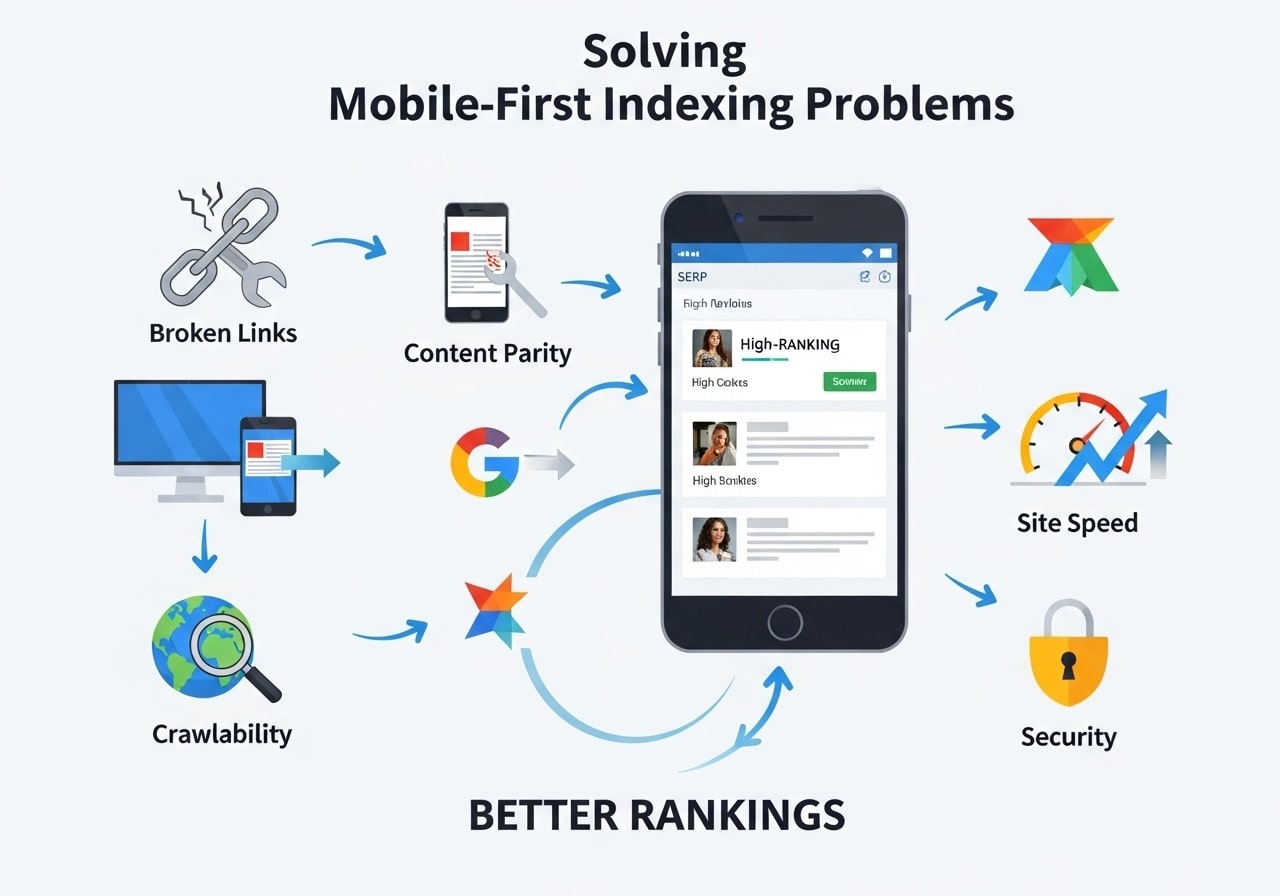
Are you struggling with mobile-first indexing problems SEO experts warn about? You’re not alone. Since Google switched to mobile-first indexing, many websites have seen their search rankings drop because they weren’t ready for this major change in how Google crawls and indexes web pages.
What Is Mobile-First Indexing and Why It Matters
Mobile-first indexing Google introduced means that Google’s crawlers now look at your mobile website version first when deciding how to rank your pages. Before this change, Google would check your desktop site as the main version and treat mobile as secondary.
This shift happened because more people now search on phones and tablets than on computers. Google wants to show search results based on what mobile users actually see when they visit your website.
The Mobile-First Indexing Algorithm Explained
The mobile-first indexing algorithm works by sending mobile crawlers (smartphone Googlebot) to visit your website first. These crawlers check:
- How your pages look on mobile devices
- Whether your content loads properly on phones
- If your website works well with touch navigation
- How fast your pages load on mobile connections
If your mobile site has problems, Google might not index your content properly, which hurts your search rankings.
Most Common Mobile-First Indexing Problems SEO Teams Face
1. Missing Content on Mobile Versions
Many websites hide content on mobile to save space. But when Google crawls your mobile site first, it might miss important content that only appears on desktop. This creates mobile-first indexing problems SEO professionals need to fix quickly.
Common content issues include:
- Hidden text in collapsed menus
- Images that don’t load on mobile
- Important paragraphs removed from mobile layouts
- Contact information only shown on desktop
2. Slow Loading Mobile Pages
Page speed matters even more with mobile-first indexing. If your mobile pages load slowly, Google’s crawlers might not wait around to see your content. This affects both indexing and user experience.
Speed problems often come from:
- Large images not optimized for mobile
- Too many plugins or scripts
- Poor hosting that can’t handle mobile traffic
- Heavy CSS and JavaScript files
3. Navigation and Usability Issues
How does mobile-first indexing affect your website navigation? Google checks if users can actually find and use your content on mobile devices. Websites with poor mobile navigation often see ranking drops.
Navigation problems include:
- Menus that don’t work with touch
- Links too close together
- Important pages buried in mobile menus
- Search functions that don’t work on phones
4. Structured Data and Schema Markup Issues
Many websites only include structured data on their desktop versions. Since Google now checks mobile first, missing schema markup on mobile pages can hurt your search visibility.
How Does Mobile-First Indexing Affect Your Website Performance
How does mobile-first indexing affect your website rankings and traffic? The impact can be significant if your site isn’t properly optimized.
Positive Effects for Mobile-Optimized Sites
Websites that follow mobile-first indexing best practices often see:
- Better search rankings for mobile searches
- Increased mobile traffic
- Higher user engagement on mobile devices
- Improved click-through rates from search results
Negative Effects for Poor Mobile Sites
Sites with mobile problems might experience:
- Drops in search rankings
- Less organic traffic
- Higher bounce rates
- Fewer conversions from mobile users
Traffic and Revenue Impact
Studies show that websites lose an average of 20% of their organic traffic when they have serious mobile-first indexing issues. E-commerce sites can lose even more revenue if their mobile shopping experience is poor.
Mobile-First Indexing Best Practices for Better Rankings
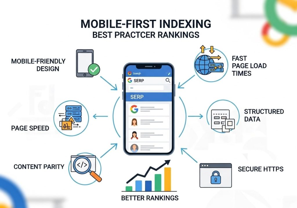
Implement Responsive Design Principles
A mobile-first strategy employs responsive design principles to ensure your website works well on all devices. Responsive design automatically adjusts your layout based on screen size.
Key responsive design elements:
- Flexible grid layouts that resize
- Images that scale properly
- Text that remains readable on small screens
- Touch-friendly buttons and links
Mobile-First Approach to Web Design
What is a mobile-first approach to web design? It means designing your website for mobile devices first, then scaling up to larger screens. This approach ensures mobile users get the best experience.
Steps for mobile-first design:
- Start with mobile wireframes
- Focus on essential content and features
- Use progressive enhancement for desktop
- Test on real mobile devices regularly
CSS and Development Best Practices
Mobile-first approach CSS techniques help create better mobile experiences:
/* Mobile-first CSS example */
.container {
width: 100%;
padding: 10px;
}
/* Desktop styles added later */
@media (min-width: 768px) {
.container {
max-width: 1200px;
padding: 20px;
}
}
Popular frameworks like Tailwind CSS mobile-first approach make it easier to build responsive websites that work well with mobile-first indexing.
Content Optimization Strategies
Make sure your mobile content includes:
- All important text from your desktop version
- Proper headings and structure
- Readable font sizes (at least 16px)
- Sufficient spacing between elements
- Fast-loading, optimized images
Technical SEO for Mobile-First
Technical improvements for mobile-first indexing SEO:
- Use the same URLs for mobile and desktop
- Implement proper canonical tags
- Include all structured data on mobile
- Ensure fast server response times
- Enable compression and caching
How to Check Mobile-First Indexing Status
Google Search Console Methods
How to check mobile-first indexing? Google Search Console provides several ways:
- URL Inspection Tool: Check individual pages to see if they’re indexed via mobile-first
- Settings: Look for mobile-first indexing notifications
- Coverage Reports: Identify pages with mobile indexing issues
- Core Web Vitals: Monitor mobile performance metrics
Google Mobile-Friendly Test
The Google Mobile-Friendly Test helps identify basic mobile usability issues. Enter your URL to check:
- Whether Google sees your page as mobile-friendly
- Specific usability problems to fix
- Loading issues on mobile devices
Additional Testing Tools
Other helpful tools for mobile-first index search optimization:
- PageSpeed Insights for mobile performance
- Mobile Simulator tools for testing designs
- Real device testing on various phones and tablets
- Analytics data to track mobile user behavior
Implementing a Mobile-First Strategy with Responsive Design

Planning Your Mobile-First Strategy
A successful mobile-first strategy starts with understanding your mobile users:
- Analyze your mobile traffic data
- Identify top mobile user journeys
- Review mobile conversion paths
- Study mobile search behavior
Responsive Design Implementation
Responsive design mobile-first approach best practices:
Flexible Layouts
- Use percentage-based widths instead of fixed pixels
- Implement CSS Grid and Flexbox for better layouts
- Create breakpoints that make sense for your content
- Test layouts on various screen sizes
Image Optimization
- Use responsive images with srcset attributes
- Implement lazy loading for better performance
- Choose appropriate image formats (WebP when possible)
- Compress images without losing quality
Typography and Readability
- Use scalable fonts that work on all devices
- Maintain proper line spacing and paragraph breaks
- Ensure sufficient color contrast
- Test readability on actual mobile devices
Performance Optimization
Speed is crucial for mobile-first indexing Google rankings:
Core Web Vitals
- Largest Contentful Paint (LCP) under 2.5 seconds
- First Input Delay (FID) under 100 milliseconds
- Cumulative Layout Shift (CLS) under 0.1
Technical Improvements
- Minimize HTTP requests
- Enable browser caching
- Use Content Delivery Networks (CDNs)
- Optimize CSS and JavaScript delivery
Tools and Testing for Mobile-First Success
Essential Testing Tools
How to optimize for mobile-first indexing? Start with proper testing:
Google Tools
- Google Search Console for indexing status
- PageSpeed Insights for performance metrics
- Google Mobile-Friendly Test for basic usability
- Google Analytics for mobile user data
Third-Party Tools
- GTmetrix for detailed performance analysis
- Screaming Frog for technical SEO audits
- BrowserStack for cross-device testing
- Lighthouse for comprehensive audits
Regular Monitoring and Maintenance
Set up regular checks for mobile-first indexing problems SEO:
- Weekly performance monitoring
- Monthly technical SEO audits
- Quarterly user experience reviews
- Ongoing competitor analysis
Common Testing Scenarios
Test these scenarios regularly:
- New content publication on mobile
- E-commerce checkout processes
- Form submissions and lead generation
- Site search functionality
- Social media integration
Future of Mobile-First Indexing Google Updates
Upcoming Changes and Trends
Google continues improving mobile-first indexing with focus on:
- Better understanding of mobile user intent
- Improved handling of dynamic content
- Enhanced performance signal integration
- Advanced mobile usability factors
Preparing for Future Updates
Stay ahead of mobile-first indexing problems SEO challenges:
- Follow Google Search Central documentation
- Subscribe to Google Webmaster blog updates
- Attend SEO conferences and webinars
- Join professional SEO communities
- Test new features in Google Search Console
Long-term Mobile Strategy
Building sustainable mobile success requires:
- Continuous user experience improvements
- Regular performance optimization
- Staying updated with mobile technology trends
- Investing in mobile-first development practices
Mobile-first indexing problems SEO teams face are real, but they’re definitely solvable. By focusing on responsive design, fast loading times, and great mobile user experiences, you can turn mobile-first indexing from a challenge into an advantage.
Does Google prioritize mobile-first indexing? Yes, absolutely. Mobile-first isn’t going anywhere – it’s the future of how Google understands and ranks websites. Start implementing these best practices today to protect your search rankings and provide better experiences for your mobile users.
Take action now by running a Google Mobile-Friendly Test on your website and checking your mobile-first indexing status in Google Search Console. Your future search rankings depend on how well you adapt to this mobile-first world.
FAQs
What is mobile’d be happy to help-first indexing and why should I care about you create a comprehensive FAQ section! it?
Mobile-first indexing However, I notice means Google looks that both at your mobile the ” website version first whenGiven Topic” and “Context” fields deciding how to rank your in your request are empty.
To site in search results. Since craft the most most people browse the relevant and useful FAQs for internet on their your needs, coul phones nowd you please provide:
, Google switched to checkingThe specific topic you’d like the FAQs to mobile sites primarily. cover (e.g., “online If your mobile site has problems banking,” “product returns,” “subscription, your services,” etc.) search rankings can
The context where drop these FAQs will be used ( significantly.
Howe.g., “e-commerce website,” “mobile app,” “customer service do I know if my website has mobile-first indexing issues?
You portal,” “product manual,” etc.)
Once you share these details, I’ll create 10 can check Google Search Console for targeted FAQ messages about mobile pairs that directly-first indexing. Look for warnings address what your audience is most likely to ask about content differences between mobile and desktop versions, slow loading times on mobile, or blocke about. This way, the questions and resources. Youd answers will be perfectly tail can also use Google’s Mobile-ored to your specific situationFriendly Test tool to see how your site performs on mobile devices.
My and will actually help your users find the information they need quickly mobile site loads really slowly. How does this hurt.
Just reply with the topic and context, and I my SEO?
Slow mobile loading speeds’ll get started on your directly hurt your search FAQs right away! rankings because Google considers page speed as a ranking factor. If your mobile site takes more than 3 seconds to load, visitors often leave, which increases your bounce rate. Google sees this as a sign that your site doesn’t provide a good user experience.
Why does my website look different on mobile compared to desktop?
This usually happens when your mobile version is missing content, images, or features that exist on your desktop version. Google wants to see the same important content on both versions. If your mobile site has less content, Google might rank you lower because they’re primarily looking at your mobile version now.
What’s the biggest mistake people make with mobile-first indexing?
The biggest mistake is hiding or removing important content from the mobile version to save space. Many website owners think they’re helping mobile users by showing less content, but this actually hurts their SEO because Google can’t see that content when indexing their site.
Do images matter for mobile-first indexing?
Yes, images are important for mobile-first indexing. Make sure your images load properly on mobile devices and include alt text descriptions. If images are blocked or don’t load on mobile, Google can’t see them, which can hurt your rankings, especially for image search results.
Should I create a separate mobile website or use responsive design?
Responsive design is usually the better choice. With responsive design, you have one website that adapts to different screen sizes automatically. Separate mobile sites (like m.website.com) can cause problems because you need to maintain two versions and ensure they have the same content.
How can I fix mobile navigation issues that hurt my SEO?
Make sure your mobile navigation is easy to use and includes links to all your important pages. Avoid hiding navigation menus that users can’t find easily. If Google can’t crawl all your pages through mobile navigation, some of your content might not get indexed properly.
What should I do if Google says my mobile and desktop content don’t match?
Review both versions of your site and make sure they have the same main content, headlines, images, and links. Don’t remove content from mobile just to make it look cleaner. If you need to organize content differently on mobile, that’s fine, but the same information should be available.
How long does it take to see SEO improvements after fixing mobile-first indexing problems?
You might start seeing some improvements within a few weeks, but significant changes usually take 2-3 months. Google needs time to re-crawl and re-index your site after you make changes. Keep monitoring your search console data and be patient as Google updates their understanding of your improved mobile site.