
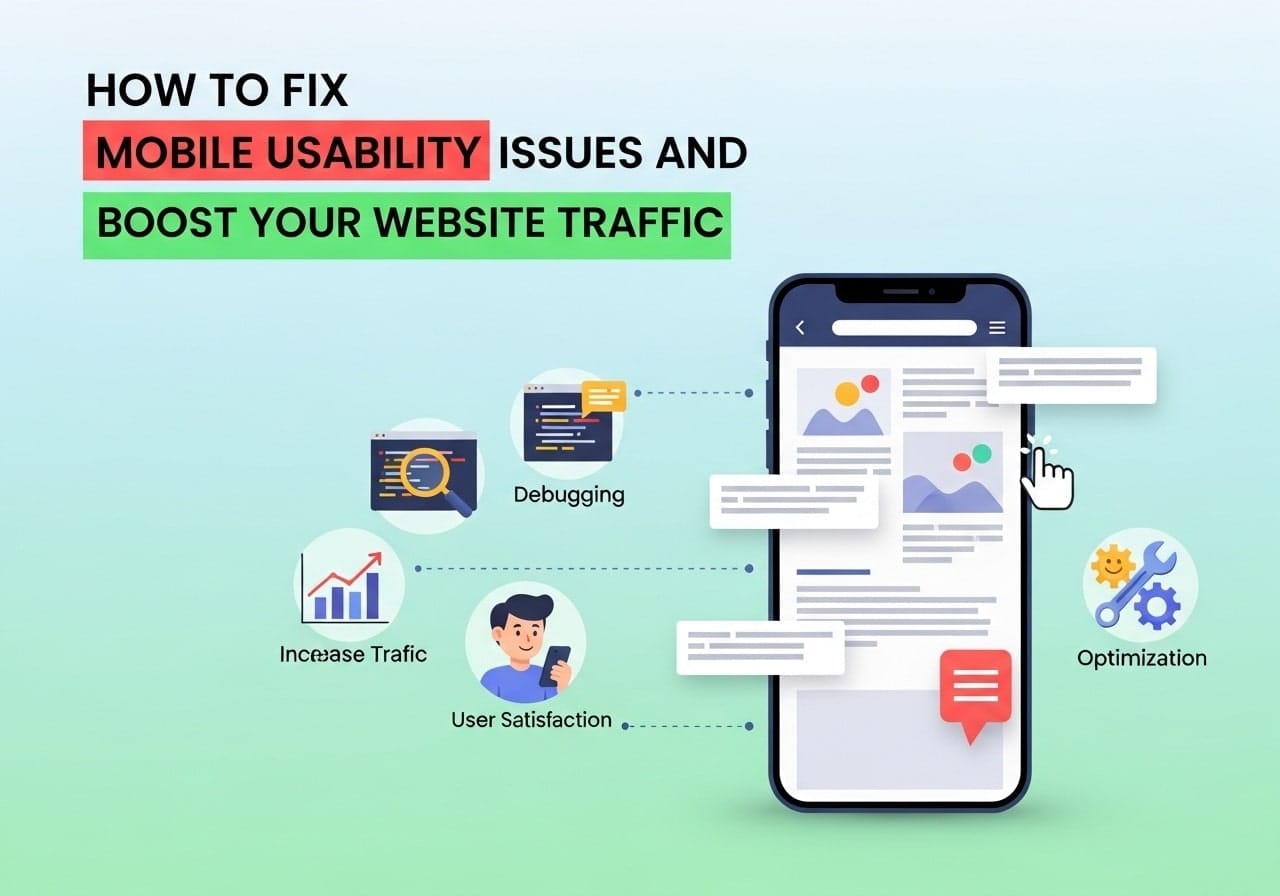
What Are Mobile Usability Issues? Mobile usability issues are problems that make your website difficult to use on smartphones and tablets. These problems can range from text that’s too small to read, buttons that are hard to tap, or pages that don’t load properly on mobile devices. When visitors can’t easily navigate your site on their phones, they’ll likely leave and never come back.
What is mobile usability? Simply put, it’s how well your website works for people using mobile devices. A mobile-friendly website should be easy to read, navigate, and use without zooming, scrolling sideways, or struggling to tap buttons.
Understanding what are usability issues helps you create a better experience for your mobile visitors. These issues directly impact your search engine rankings since Google uses mobile-first indexing, meaning they primarily look at the mobile version of your site when determining rankings.
Why Mobile Usability Matters for SEO
How to fix mobile usability issues for SEO has become crucial because more than half of all web traffic now comes from mobile devices. Google recognizes this shift and rewards websites that provide excellent mobile experiences with higher search rankings.
When your website has mobile usability problems, Google may:
- Lower your search rankings
- Show fewer pages from your site in search results
- Display mobile usability warnings in Google Search Console
- Reduce your overall website visibility
Mobile-responsive design isn’t just nice to have anymore – it’s essential for maintaining and improving your SEO performance. Search engines want to show users websites that work well on their devices.
How to Test Mobile Usability
How to test mobile usability should be part of your regular website maintenance routine. Here are several effective methods:
Google’s Mobile-Friendly Test Tool
This free tool from Google analyzes any webpage and tells you if it’s mobile-friendly. Simply enter your URL, and you’ll get immediate feedback about mobile usability problems.
Google Search Console
Your Search Console account provides detailed mobile usability reports. It shows exactly which pages have issues and what specific problems Google found.
Manual Testing Methods
How to do mobile testing manually involves checking your site on actual mobile devices:
- Test on different screen sizes
- Try both portrait and landscape orientations
- Check loading speeds on mobile networks
- Test all interactive elements like forms and buttons
Browser Developer Tools
Most modern browsers include mobile simulation features. You can test how your site looks on various device sizes without owning multiple phones or tablets.
Common Mobile Usability Problems
Text Too Small to Read
Many websites display text that’s perfectly readable on desktop computers but becomes tiny and unreadable on mobile screens. The solution involves adjusting font sizes and line heights for mobile devices.
Clickable Elements Too Close Together
When buttons, links, or other clickable items are placed too close together, users accidentally tap the wrong elements. This creates frustration and poor user experience.
Content Wider Than Screen
Why would a website work on desktop but not mobile? Often, it’s because the content is designed for wide desktop screens. When this content doesn’t adjust to smaller screens, users must scroll horizontally to see everything.
Slow Loading Times
Mobile users expect fast-loading pages. Sites that load slowly on mobile connections lose visitors quickly and rank poorly in search results.
Missing Viewport Meta Tag
Without proper viewport settings, mobile browsers don’t know how to display your content, leading to various display problems.
How to Fix Mobile Usability Issues Step by Step
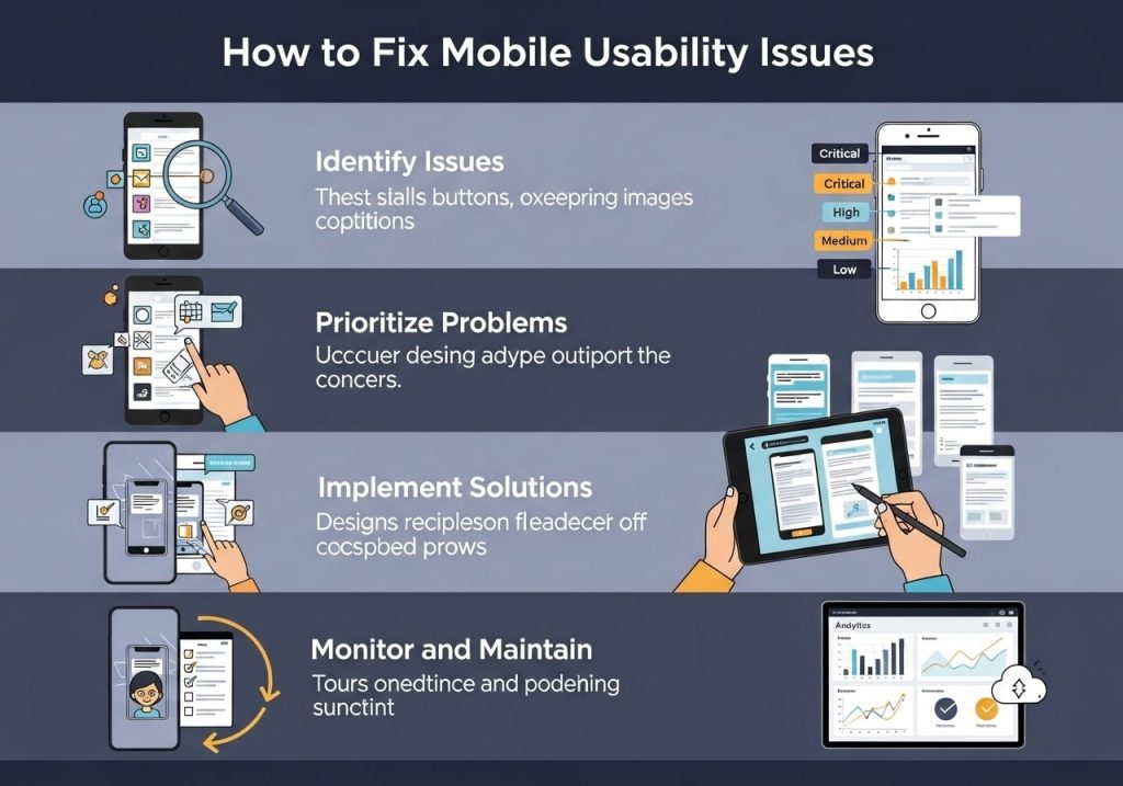
Step 1: Identify the Problems
Start by running your website through Google’s Mobile-Friendly Test and checking Google Search Console for mobile usability reports. Make a list of all identified issues.
Step 2: Implement Responsive Design
What is meant by mobile-responsive? It means your website automatically adjusts its layout, images, and content to fit different screen sizes. This involves:
- Using flexible grid layouts
- Setting images to scale with screen size
- Creating breakpoints for different device sizes
- Testing across multiple devices
Step 3: Fix Font and Text Issues
Ensure all text is readable without zooming:
- Set minimum font sizes of 16px for body text
- Use adequate line spacing
- Choose fonts that display well on small screens
- Ensure sufficient color contrast
Step 4: Optimize Touch Elements
Make buttons and links easier to tap:
- Minimum touch target size of 44px
- Add adequate spacing between clickable elements
- Make important buttons prominent and easy to find
- Test all interactive elements on actual devices
Step 5: Address Content Width Problems
How to make an unresponsive website responsive requires adjusting how content displays:
- Use CSS media queries to control layout at different screen sizes
- Set max-width properties for content containers
- Make images responsive with proper CSS rules
- Remove horizontal scrolling requirements
How to Fix Mobile Usability Issues in WordPress
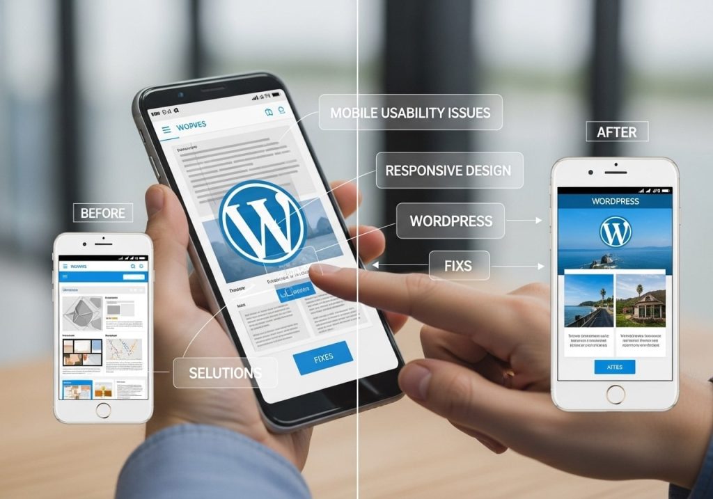
Choose a Mobile-Responsive Theme
Start with a theme that’s built to be mobile-friendly. Most modern WordPress themes include responsive design, but older themes may need updating or replacement.
Install Mobile Optimization Plugins
Several WordPress plugins can help improve mobile usability:
- WP Mobile Detect for mobile-specific features
- AMP plugins for faster mobile loading
- Mobile menu plugins for better navigation
- Image optimization plugins to reduce loading times
Customize Your Mobile Design
WordPress allows you to:
- Adjust mobile-specific settings in your theme customizer
- Use different menu structures for mobile devices
- Control which widgets appear on mobile
- Optimize your mobile site’s appearance
Test WordPress Mobile Performance
Regular testing ensures your WordPress site remains mobile-friendly:
- Check after theme updates
- Test when adding new plugins
- Verify mobile performance after content changes
- Monitor mobile loading speeds
Testing Your Mobile Performance
How do I test my mobile performance? Regular testing helps maintain good mobile usability:
Performance Testing Tools
- Google PageSpeed Insights shows mobile loading speeds
- GTmetrix provides detailed performance reports
- Pingdom tests loading times from different locations
- WebPageTest offers comprehensive mobile analysis
User Experience Testing
How to run a usability test for mobile involves:
- Asking real users to complete tasks on mobile devices
- Observing where users struggle or get confused
- Collecting feedback about mobile site navigation
- Making improvements based on user input
Regular Monitoring
Set up regular checks to catch mobile usability problems early:
- Weekly Google Search Console reviews
- Monthly mobile performance testing
- Quarterly comprehensive mobile audits
- Immediate testing after website changes
Mobile Accessibility Best Practices
How to test mobile accessibility ensures your site works for all users, including those with disabilities:
Screen Reader Compatibility
Make sure your mobile site works with screen readers by:
- Using proper heading structures
- Adding alt text to all images
- Ensuring keyboard navigation works
- Testing with actual screen reader software
Visual Accessibility
Improve visual accessibility through:
- High color contrast ratios
- Scalable text that works with zoom functions
- Clear visual hierarchy
- Avoiding color-only information conveyance
Motor Accessibility
Help users with motor difficulties by:
- Making touch targets large enough
- Providing adequate time for interactions
- Offering alternative input methods
- Avoiding complex gesture requirements
Improving Website Performance on Mobile

How to improve website performance in mobile involves multiple optimization strategies:
Image Optimization
Large images slow down mobile loading significantly:
- Compress images without losing quality
- Use modern image formats like WebP
- Implement lazy loading for images
- Serve appropriately sized images for different devices
Code Optimization
Clean, efficient code loads faster on mobile:
- Minimize CSS and JavaScript files
- Remove unused code and plugins
- Enable browser caching
- Use content delivery networks (CDNs)
Content Strategy
Optimize your content for mobile consumption:
- Write shorter paragraphs for mobile reading
- Use bullet points and lists for easy scanning
- Break up long content with subheadings
- Prioritize the most important information
Mobile-First Design Approach
Design for mobile devices first, then adapt for larger screens:
- Start with mobile layouts and expand upward
- Prioritize essential content and features
- Simplify navigation for touch interfaces
- Focus on core user tasks and goals
How to check mobile friendliness of website should be an ongoing process, not a one-time fix. Regular monitoring and testing help ensure your site continues providing excellent mobile experiences as technology and user expectations evolve.
The mobile web continues growing, making mobile usability more important than ever. By following these steps and regularly testing your site, you can fix mobile usability issues and create a website that works beautifully for all your visitors, regardless of the device they’re using.
Start by testing your current mobile performance, identify the most critical issues, and tackle them systematically. Your improved mobile usability will lead to better user experiences, higher search rankings, and increased website success.
FAQs
What are mobile usability issues and why should I care about them?
Mobile usability issues are problems that make your website hard to use on phones and tablets. These include things like tiny text, buttons that are too close together, slow loading times, or content that doesn’t fit the screen properly. You should care because most people browse the web on their phones now, and Google actually ranks mobile-friendly sites higher in search results.
How do I know if my website has mobile usability problems?
The easiest way is to check Google Search Console – it has a “Mobile Usability” report that shows you exactly what’s wrong. You can also use Google’s Mobile-Friendly Test tool by typing in your website URL. Don’t forget to simply visit your site on your phone and see how it looks and feels when you try to navigate around.
What are the most common mobile usability problems I should look for?
The big ones are text that’s too small to read, clickable elements that are too close together, content that’s wider than the screen, and pages that load too slowly. You might also have pop-ups that cover the whole screen or forms that are impossible to fill out on a small screen.
Can fixing mobile usability issues really increase my website traffic?
Yes, absolutely. Google uses mobile-friendliness as a ranking factor, so fixing these issues can help your site show up higher in search results. Plus, when people can actually use your site on their phones, they’re more likely to stay longer, visit more pages, and come back again.
How do I make my text readable on mobile devices?
Make sure your text is at least 16 pixels in size – anything smaller is hard to read on phones. Use fonts that are clear and simple, and make sure there’s enough contrast between your text color and background color. Also, keep your paragraphs short since long blocks of text are tough to read on small screens.
What should I do about buttons and links that are too close together?
Space out your clickable elements so there’s at least 48 pixels between them. This gives people enough room to tap without accidentally hitting the wrong thing. If you have a menu with lots of links, consider making it a dropdown or hamburger menu instead of cramming everything together.
How can I fix content that’s wider than the mobile screen?
This usually happens when you have fixed-width elements or images that are too big. Use responsive design techniques like flexible layouts and CSS media queries. Make sure your images can resize automatically, and avoid setting fixed widths for your content containers.
What’s the best way to improve my website’s loading speed on mobile?
Start by compressing your images – they’re usually the biggest culprit. Remove any plugins or features you don’t really need, and consider using a content delivery network (CDN). You can test your speed with Google PageSpeed Insights, which will give you specific suggestions for improvement.
Should I create a separate mobile version of my website?
Not really. Responsive design is the way to go now – that means having one website that automatically adjusts to look good on any screen size. Separate mobile sites can cause problems with SEO and are harder to maintain. Google also prefers responsive sites over separate mobile versions.
How long does it usually take to see traffic improvements after fixing mobile issues?
You might start seeing some improvements in a few weeks, but it typically takes 2-3 months to see the full impact. Google needs time to crawl and re-evaluate your site, and it depends on how many issues you had to fix. The good news is that the improvements are usually worth the wait, and your visitors will notice the better experience right away.