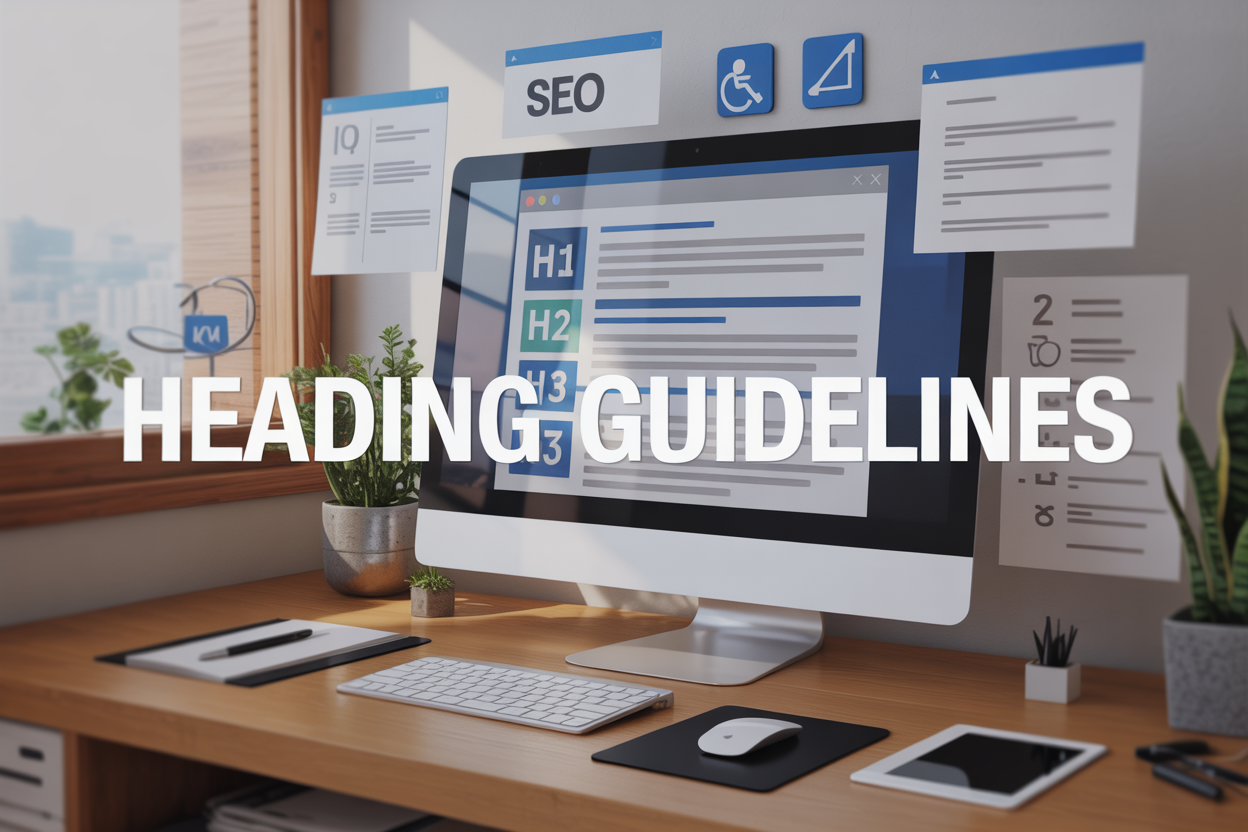
Proper headings make or break your content’s readability and search performance. These heading guidelines help writers, bloggers, content creators, and students structure their documents for maximum impact and accessibility.
When your headings follow clear formatting rules, readers scan content faster and search engines rank your pages higher. Many people struggle with heading hierarchy, accessibility requirements, and style consistency across different platforms.
This guide covers essential formatting rules that transform messy content into professional, scannable documents. You’ll learn SEO optimization strategies that help your headings attract more organic traffic. We’ll also explore accessibility best practices that make your content inclusive for all users, including those using screen readers and assistive technologies.
Understanding Heading Hierarchy for Maximum Readability
Establish clear content flow with sequential heading levels
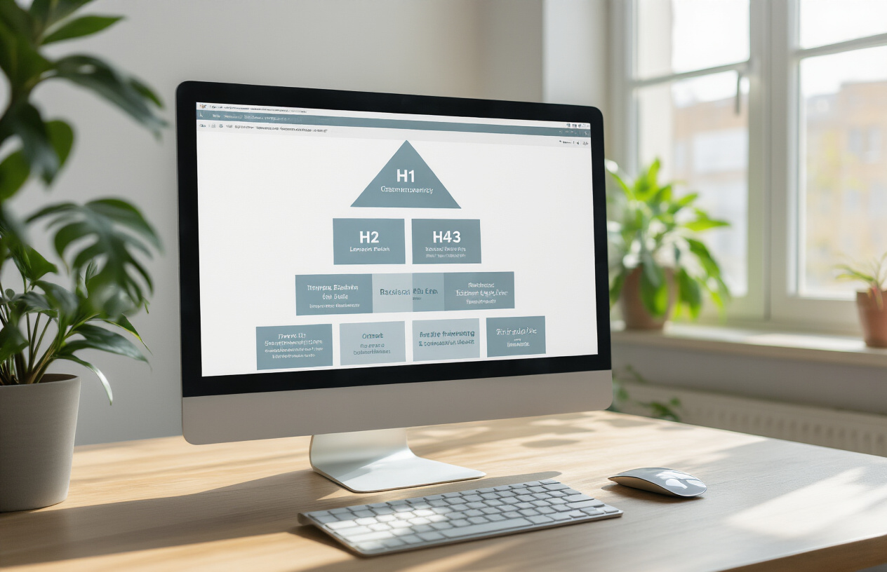
Think of heading hierarchy like the chapters and sections in your favorite book. Each heading level serves a specific purpose and follows a natural progression that guides readers through your content smoothly. When you establish clear content flow with sequential heading levels, you create a roadmap that makes your content digestible and easy to follow.
Sequential heading levels follow a logical order – H1 flows to H2, H2 branches into H3, and so on. This structure creates visual breathing room and helps readers understand the relationship between different pieces of information. Your heading style guide should always maintain this progression to avoid confusing your audience.
Avoid skipping heading levels to maintain logical structure
Jumping from H1 directly to H3 is like skipping steps on a staircase – it creates an awkward stumble in your content’s flow. When you skip heading levels, screen readers and search engines struggle to understand your content organization, which impacts both accessibility and SEO performance.
The heading and hierarchy system works best when each level connects naturally to the next. If you have an H2 section, any subsections should use H3 headings, not H4 or H5. This consistent approach ensures your heading structure remains intuitive for both human readers and automated systems processing your content.
Use H1 for main titles and reserve for single use per page
Your H1 heading functions as the main title of your page or article – like the headline on a newspaper’s front page. Following proper heading guidelines means using only one H1 per page to establish the primary topic and avoid confusing search engines about your content’s main focus.
Level 1 heading format should capture the essence of your entire piece in a compelling way. Whether you’re following APA heading guidelines or general web content standards, the H1 serves as the anchor point for all other headings on your page. Keep it descriptive, engaging, and directly related to your content’s main theme.
Implement H2 through H6 strategically for content organization
H2 headings act as your main section dividers, breaking your content into digestible chunks that readers can scan quickly. These level 2 headings should represent major topic shifts or key points within your overall theme. Use H3 headings for subsections under each H2, creating a natural subdivision of ideas.
H4 through H6 headings provide additional layers of organization for complex topics. Most content rarely needs to go beyond H4, but having these options available lets you maintain proper heading numbering when dealing with detailed technical documentation or comprehensive guides. Each level should feel like a natural subdivision of the heading above it, creating a clear content hierarchy that serves your readers’ needs.
Essential Formatting Rules That Boost User Experience

Maintain consistent capitalization style throughout your content
Picking a heading capitalization style and sticking with it makes your content look polished and professional. The three main styles you’ll encounter are title case, sentence case, and all caps. Title case capitalizes the first letter of most words, while sentence case only capitalizes the first word and proper nouns. All caps should be avoided for headings as it’s harder to read and can appear aggressive online.
Most successful websites choose either title case or sentence case based on their brand voice and audience. Tech companies often prefer sentence case for its modern, approachable feel, while traditional businesses might lean toward title case for its formal appearance. The key is consistency across all your heading levels – don’t mix styles within the same document or website.
Your heading style guide should specify which words to capitalize in title case. Generally, you’ll capitalize nouns, verbs, adjectives, and adverbs while leaving articles, conjunctions, and prepositions lowercase unless they start or end the heading. This attention to detail in your heading guidelines helps establish credibility and makes your content easier to scan.
Keep headings concise while preserving descriptive value
Effective headings strike a balance between brevity and clarity. Long, wordy headings overwhelm readers and make your content structure harder to navigate. Aim for headings that communicate the main idea in 8 words or fewer when possible. This constraint forces you to focus on the most important information and eliminates unnecessary filler words.
Short headings work better for mobile users who scan content quickly. They also perform better in search results where character limits truncate lengthy titles. However, don’t sacrifice clarity for brevity. A heading like “Tips” tells readers nothing useful, while “5 Tips for Better Sleep” provides context and sets expectations.
Consider your heading hierarchy when determining length. Level 1 headings can be slightly longer to establish the main topic, while level 2 and 3 headings should be more focused and specific. This creates a natural flow where readers move from broad concepts to specific details. Test your headings by reading them in sequence – they should tell a coherent story about your content structure.
Apply proper spacing between headings and body text
White space around headings creates visual breathing room that makes your content more readable and less overwhelming. The spacing between a heading and the text that follows should be smaller than the spacing above the heading. This creates visual groupings that help readers understand which content belongs with each heading.
Most style guides recommend 1.5 to 2 times the line spacing above headings and 1 to 1.2 times below. For example, if your body text uses 16px font with 24px line height, place about 36-48px above headings and 24-28px below. This spacing pattern guides the eye naturally through your content hierarchy.
Consistent spacing throughout your document reinforces your heading structure and makes the content feel cohesive. Avoid cramping headings too close to surrounding text, which creates a cluttered appearance. Similarly, excessive spacing breaks up the content flow and makes it harder for readers to stay engaged with your material.
SEO Optimization Strategies for Better Search Rankings

Incorporate target keywords naturally within heading text
Strategic keyword placement in headings creates a powerful foundation for search engine optimization. When crafting heading guidelines, focus on integrating your primary keywords seamlessly into the heading structure without sacrificing readability. For instance, instead of a generic “Formatting Rules,” consider “APA 7th Edition Heading Guidelines for Academic Papers.” This approach signals topical relevance to search engines while maintaining clarity for readers.
The key lies in understanding search intent behind your target keywords. Users searching for “apa heading guidelines” want specific formatting instructions, so your headings should reflect this need. Create a natural flow where keywords appear organically rather than forced. Primary keywords work best in H1 tags, while related terms like “heading capitalization rules” or “heading structure” can enhance H2 and H3 tags effectively.
Structure headings to support featured snippet opportunities
Featured snippets reward well-organized content that directly answers user queries. Structure your heading hierarchy to create clear question-and-answer patterns that search engines can easily extract. Use headings that mirror common search queries like “What is a level 1 heading?” or “How to use heading 1 and heading 2 in Word?”
Create scannable content by formatting headings as direct responses to user questions. This approach increases your chances of capturing featured snippet positions for searches related to heading format guidelines. Consider using numbered lists, bullet points, and table formats within your heading structure to provide information in easily digestible chunks that align with how featured snippets typically display content.
Balance keyword optimization with user-friendly language
Effective heading optimization requires striking the right balance between search engine visibility and human readability. While incorporating terms like “heading numbering” and “heading style guide” helps with rankings, these phrases should enhance rather than hinder the user experience. Avoid keyword stuffing that creates awkward, unnatural heading text.
Focus on creating headings that serve your audience first. A heading like “Essential Heading Capitalization Rules That Improve Document Clarity” works better than “Heading Capitalization Rules Heading Guidelines APA Format.” The first option maintains keyword relevance while providing clear value to readers, which ultimately supports better engagement metrics and improved search performance.
Utilize heading tags to strengthen topical relevance
Proper heading tag usage creates semantic relationships that reinforce your content’s topical authority. Organize related concepts under appropriate heading levels to build thematic clusters around core topics like APA guidelines for headings and subheadings. This hierarchical structure helps search engines understand the depth and breadth of your content coverage.
Implement heading tags strategically to create content silos that support each other. For example, group all heading level 1 guidelines under one H2, then break down specific aspects like heading 1 style, heading 2 style, and heading 3 APA formatting under H3 tags. This organization strengthens your content’s relevance for various related search queries while improving overall user navigation.
Accessibility Best Practices for Inclusive Content Design

Ensure headings provide meaningful navigation for screen readers
Screen readers rely heavily on heading structure to help users navigate content efficiently. When someone uses assistive technology, they can jump between headings to quickly scan your content and find what they need. This makes your heading guidelines absolutely critical for accessibility.
Create headings that clearly describe the content that follows. Instead of vague headings like “Introduction” or “More Information,” use specific descriptions like “Benefits of Proper Heading Structure” or “Common Formatting Errors to Avoid.” Your heading hierarchy should follow a logical sequence – never skip from Heading 1 directly to Heading 3, as this confuses screen readers and breaks the content flow.
Screen reader users often generate a heading outline to understand your page structure before diving into specific sections. If your headings don’t provide clear navigation landmarks, you’re creating barriers for these users.
Maintain sufficient color contrast for visually impaired users
Color contrast plays a huge role in making headings readable for people with visual impairments. Your heading style guide should specify minimum contrast ratios that meet accessibility standards.
Text headings need a contrast ratio of at least 4.5:1 against their background, while large headings (18pt bold or 24pt regular) require a minimum of 3:1. Don’t rely solely on color to distinguish headings from body text – use size, weight, and spacing as well.
Test your heading capitalization rules and formatting choices against various backgrounds. What looks good on white might fail miserably on colored backgrounds. Tools like WebAIM’s Contrast Checker can help you verify your color combinations meet accessibility requirements.
Create descriptive headings that work without visual context
Your headings should make sense even when read out of visual context. Screen readers announce headings without the surrounding design elements, so each heading must stand alone as a meaningful description.
Avoid headings that depend on visual cues like “See Chart Below” or “As Shown Above.” Instead, write headings that directly describe the content: “Monthly Sales Performance Data” or “Implementation Timeline Overview.”
Consider how your heading numbering and heading structure will sound when read aloud. A heading like “Step 3: Configure Settings” provides clear context, while just “Configure Settings” might confuse users about where they are in a process.
Test heading structure with accessibility tools
Regular testing ensures your heading format meets real-world accessibility needs. Use both automated tools and manual testing to catch potential issues.
Screen reader software like NVDA or JAWS can reveal how your heading hierarchy actually sounds to users. Browser extensions like HeadingsMap or Accessibility Insights provide visual representations of your heading structure.
Test your heading 1-6 implementation across different devices and assistive technologies. What works perfectly on desktop might have issues on mobile screen readers. Manual testing with actual assistive technology users provides invaluable feedback that automated tools can miss.
Follow WCAG guidelines for proper heading implementation
Web Content Accessibility Guidelines (WCAG) provide specific requirements for heading implementation. Level AA compliance requires that headings and labels describe topic or purpose, while proper heading structure supports programmatic navigation.
Your level heading format should follow WCAG’s emphasis on logical sequence and meaningful organization. Don’t use headings purely for visual styling – every heading should serve a structural purpose in your content hierarchy.
WCAG guidelines also stress the importance of consistent heading patterns throughout your site. Establish clear heading rules that your entire team can follow, ensuring users experience predictable navigation patterns across all your content.
Common Formatting Mistakes That Damage Content Quality

Recognize When Decorative Text Masquerades as Proper Headings
Many content creators fall into the trap of treating headings like decorative elements rather than functional navigation tools. This happens when you make regular text bold, increase font size, or change colors without using actual heading tags (H1, H2, H3, etc.) in your content management system or word processor.
Screen readers and search engines can’t identify these styled text elements as true headings, which creates serious accessibility and SEO problems. When you manually format text to look like a heading without proper heading structure, you’re essentially creating fake headings that serve no functional purpose beyond visual appeal.
Real headings should follow proper heading hierarchy guidelines and use semantic markup. If you’re working in Word, use the built-in heading styles rather than manually formatting text. For web content, ensure your CMS applies proper HTML heading tags. This approach supports both apa heading guidelines and general content accessibility standards.
Avoid Using Headings Solely for Visual Styling Purposes
Using headings just because you want bigger, bolder text damages your content’s logical flow and confuses readers trying to scan your document. Headings exist to organize information hierarchically, not to make certain phrases stand out visually.
Consider these problematic examples:
- Using heading 1 style for emphasis in the middle of paragraphs
- Applying heading 2 style to quotes or callout boxes
- Creating fake subheadings that don’t actually introduce new sections
When you need visual emphasis without structural meaning, use bold text, italics, or other formatting options instead. Save headings for content that truly represents a new section, subsection, or topic shift. This practice aligns with apa 7th edition heading guidelines and improves overall document organization.
Prevent Inconsistent Heading Styles That Confuse Readers
Inconsistent heading capitalization rules and formatting create cognitive friction for readers trying to navigate your content. Mixing title case with sentence case, switching between bold and regular formatting, or using different fonts for the same heading level destroys the visual hierarchy that helps readers understand your content structure.
Common consistency problems include:
| Issue | Example | Better Approach |
|---|---|---|
| Mixed capitalization | “How To Format” vs “How to format” | Choose one style and stick with it |
| Inconsistent numbering | “1. First Point” then “B. Second Point” | Use consistent numbering systems |
| Font variations | Arial for H2, Times for H3 | Maintain uniform font families |
Establish a clear heading style guide before you start writing and apply it consistently throughout your document. Whether you’re following apa guidelines for headings and subheadings or creating your own system, consistency builds trust with readers and helps them navigate your content efficiently. Your heading structure should feel predictable and logical from start to finish.

Getting your headings right makes a huge difference in how people interact with your content. When you follow proper hierarchy, stick to clean formatting, and optimize for search engines, you create content that’s easy to scan and understand. Your readers can quickly find what they need, search engines can better index your pages, and everyone – including people using assistive technologies – can navigate your content without frustration.
The mistakes we covered might seem small, but they add up fast and can seriously hurt your content’s performance. Start by auditing your current content and fixing any hierarchy issues or accessibility problems you spot. Your audience will thank you with longer page visits, better engagement, and higher conversion rates. Take a few minutes to review your next piece of content with these guidelines in mind – you’ll be amazed at the difference proper heading structure can make.
FAQs
What are heading tags and why do they matter?
Heading tags are HTML elements (H1, H2, H3, etc.) that create a clear structure for your content. They help both readers and search engines understand what your page is about and how your information is organized. Think of them like the table of contents in a book – they guide people through your content.
Should I use more than one H1 tag on a page?
It’s best to stick with just one H1 tag per page. Your H1 should be the main title that tells visitors what the entire page is about. Having multiple H1 tags can confuse search engines and make your content structure unclear.
How do I create a proper heading hierarchy?
Start with your H1 as the main title, then use H2 for major sections, H3 for subsections under H2, and so on. Don’t skip levels – for example, don’t jump from H2 straight to H4. Keep it logical, like organizing folders on your computer.
What’s the difference between H1\, H2\, H3\, and other heading levels?
Each heading level represents a different importance in your content structure. H1 is the most important (your main title), H2 is for main sections, H3 for subsections, H4 for sub-subsections, and so on. Each level gets smaller and less prominent visually.
How long should my headings be?
Keep your headings short and sweet – usually between 20-70 characters works well. They should be descriptive enough to tell readers what to expect but not so long that they become hard to read or look cluttered on the page.
Can I style my headings to look different from the default appearance?
Yes, you can change how your headings look using CSS. You can adjust the font size, color, weight, and spacing. Just remember that the visual appearance doesn’t change the structural importance – an H3 is still an H3 even if you make it look bigger than an H2.
Should my headings include keywords for SEO?
Including relevant keywords in your headings can help with SEO, but don’t stuff them unnaturally. Write headings that make sense to your readers first. If you can naturally include keywords that describe your content, that’s great, but readability comes first.
What happens if I don’t use headings properly?
Poor heading structure makes your content harder to read and navigate. Screen readers used by visually impaired users rely on headings to jump between sections. Search engines also use headings to understand your content, so bad structure might hurt your rankings.
How many headings should I use on a page?
There’s no magic number, but use headings naturally to break up your content. If you have long paragraphs or different topics on one page, headings help make everything more digestible. Just don’t overdo it – every other sentence doesn’t need a heading.
Can I use headings just to make text look bigger?
No, don’t use headings just for styling. Headings have a specific purpose in content structure. If you want bigger text for emphasis, use CSS to style regular text instead. Save headings for actually organizing your content into sections.