
Your brand cover images and profile photos are the first things people notice when they visit your social media pages or website. They’re your digital storefront, and getting them right can make or break that crucial first impression.
This guide is for business owners, marketing teams, and entrepreneurs who want to create a cohesive visual presence that actually converts browsers into customers. You’ll learn how to build a strong brand image strategy that works across all your platforms.
We’ll walk through the basics of visual brand identity so you understand what makes some brands instantly recognizable. Then we’ll show you how to optimize your profile photos for maximum impact and create cover images that grab attention and drive engagement. You’ll also discover how to keep everything looking consistent whether someone finds you on Instagram, LinkedIn, or your website.
Understanding Brand Visual Identity Fundamentals
Define your brand’s core visual elements
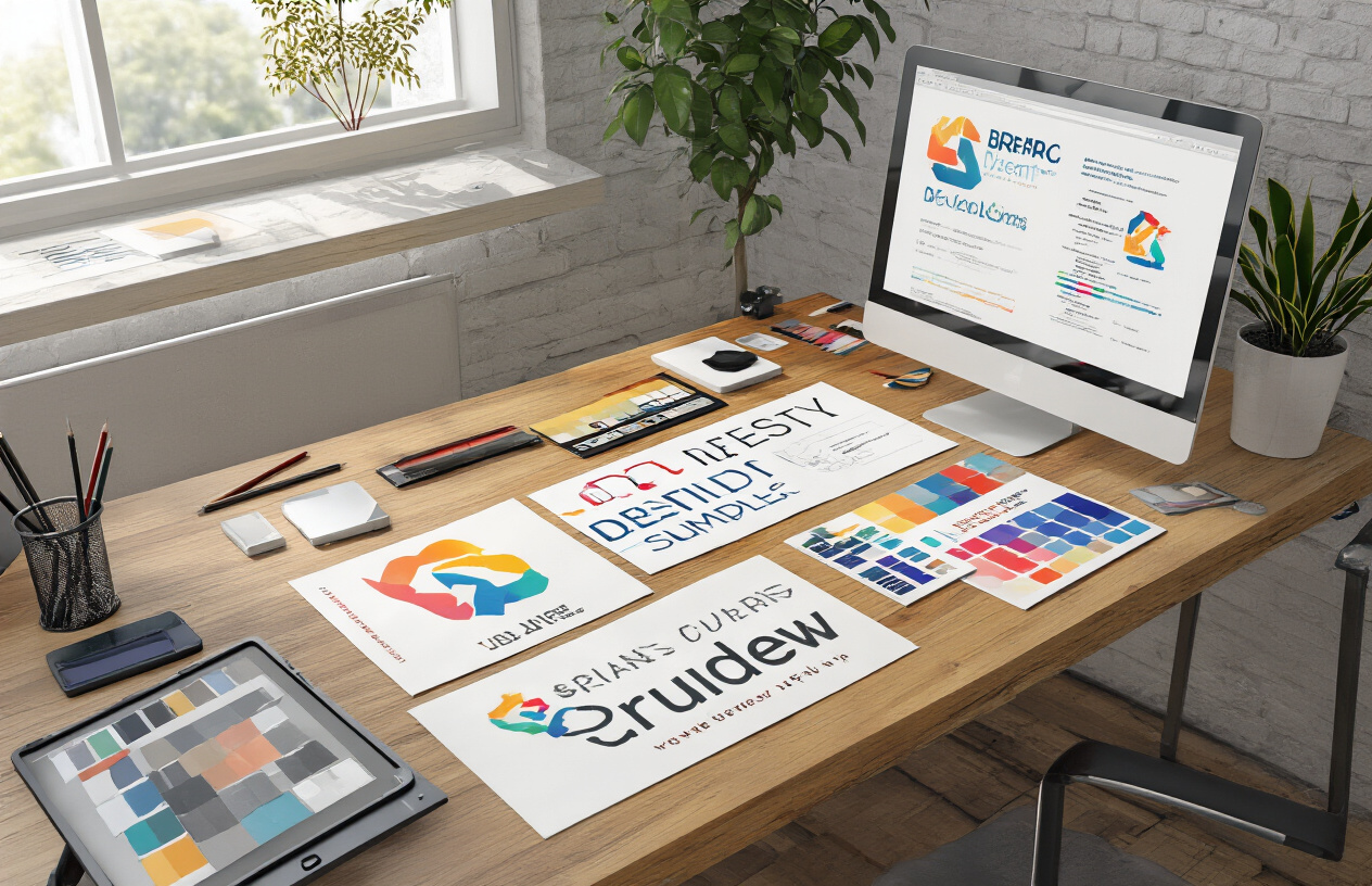
Your brand’s visual foundation starts with identifying the essential elements that will appear across all platforms. These core components include your logo, color scheme, typography choices, imagery style, and graphic elements. Think of these as your brand’s DNA – they should remain consistent whether someone encounters your business on Instagram, your website, or printed materials.
Start by documenting your primary logo and its variations. This includes horizontal and vertical layouts, simplified versions for small spaces, and single-color alternatives. Your brand images need these flexible options to work effectively across different platforms and sizes.
Next, establish your visual hierarchy. Determine which elements take priority in your brand profile picture and cover image designs. Your logo might be the hero element, but supporting graphics, patterns, or textures can reinforce your brand personality without overwhelming the main message.
Establish color palette and typography standards
Color psychology plays a crucial role in brand image strategy. Your chosen colors communicate specific emotions and values before customers even read your content. Fashion brands often leverage black for sophistication, while tech companies might choose blue for trust and reliability.
Create a structured color system with primary, secondary, and accent colors. Document specific color codes (HEX, RGB, CMYK) to ensure consistency across digital and print applications. This precision matters when creating your brand cover photo design or company cover photo ideas.
Typography choices are equally important for your brand identity pictures. Select fonts that align with your brand personality – modern sans-serif fonts convey innovation and simplicity, while serif fonts suggest tradition and reliability. Limit yourself to 2-3 font families maximum to maintain visual cohesion.
| Element | Primary Choice | Secondary Choice | Usage Guidelines |
|---|---|---|---|
| Colors | Main brand color | Supporting colors | 60-30-10 rule application |
| Typography | Headlines/Logos | Body text | Hierarchy and readability |
| Imagery Style | Photography tone | Graphic elements | Consistent filters/effects |
Create a cohesive brand style guide
A comprehensive style guide serves as your visual rulebook for all branding images and company profile images for business. This document should specify exact measurements, spacing requirements, and usage rules for every visual element.
Include specific guidelines for your brand cover images across different platforms. Instagram covers require different dimensions than LinkedIn banners, but your style guide should show how to adapt your brand elements for each format while maintaining recognition.
Document your imagery standards too. Whether you’re creating clothing brand cover photo ideas or professional service visuals, establish consistent photo treatments, filter preferences, and composition rules. This ensures your brand photos maintain the same look and feel regardless of who creates them.
Your style guide should also address what NOT to do. Show incorrect logo usage, poor color combinations, or inappropriate imagery styles. These negative examples prevent common mistakes that could dilute your brand image.
Align visuals with brand personality and values
Your visual choices should reflect your brand’s character and core values. A playful children’s clothing brand will use different imagery, colors, and design elements than a luxury financial services firm. This alignment creates authentic connections with your target audience.
Consider your brand personality traits when selecting visual elements. Is your brand approachable or exclusive? Traditional or innovative? These characteristics should influence every design decision, from your brand profile picture choices to your cover image brand strategy.
Test your visual elements against your brand values. If sustainability is a core value, your imagery should reflect environmental consciousness through natural textures, earth tones, or eco-friendly themes. If innovation drives your brand, incorporate cutting-edge design elements and forward-thinking aesthetics.
Regular audits help maintain this alignment. Review your existing brand ambassador images, company profile background images, and other visual assets quarterly. Ask whether they still accurately represent your brand’s evolution and values. Update elements that no longer serve your brand image description or strategic goals.
Optimizing Profile Photos for Maximum Brand Impact

Choose images that reflect your brand essence
Your brand profile picture serves as the first impression for potential customers scrolling through social platforms. Think of it as a digital handshake that communicates who you are in just a few seconds. The most effective brand profile photos capture the core personality of your business while remaining instantly recognizable.
Start by defining your brand’s character. Are you approachable and friendly, or sophisticated and professional? A playful children’s clothing brand might use bright, colorful imagery with fun elements, while a luxury consulting firm would lean toward clean, minimalist photography. Your brand image should tell this story without requiring explanation.
Consider what makes your brand unique. If you’re a sustainable fashion brand, incorporating natural elements or eco-friendly textures can reinforce your values. Tech companies often benefit from modern, geometric designs that suggest innovation and forward-thinking.
The key is authenticity. Your brand profile picture should feel genuine to your company’s mission and values. Avoid generic stock photos that could represent any business. Instead, invest in custom photography or graphics that capture your specific brand essence.
Maintain consistent sizing across all platforms
Different social media platforms have varying requirements for profile image dimensions, and neglecting these specifications can damage your professional appearance. A perfectly crafted brand profile photo loses its impact when it’s cropped awkwardly or appears pixelated.
Create a master file that works across multiple platforms by designing within a square format, typically 400×400 pixels minimum. This ensures your image displays clearly on Facebook, Instagram, Twitter, LinkedIn, and most other social networks. Always check platform-specific guidelines, as requirements change periodically.
| Platform | Recommended Size | Display Format |
|---|---|---|
| 170×170 pixels | Square | |
| 320×320 pixels | Square | |
| 300×300 pixels | Square | |
| 400×400 pixels | Square | |
| YouTube | 800×800 pixels | Square |
Keep important visual elements centered within your design. Platform interfaces often add circular or rounded corner masks to profile pictures, potentially cutting off text or crucial brand elements placed near the edges. Test your profile picture across different platforms before finalizing to ensure consistent brand image presentation.
Use professional quality photos with proper lighting
Poor image quality immediately signals unprofessionalism and can undermine customer trust before they even learn about your products or services. Investing in high-quality photography pays dividends in brand perception and customer confidence.
Professional lighting makes the biggest difference in photo quality. Natural light works well for many brand photos, but avoid harsh direct sunlight that creates unflattering shadows. Soft, diffused lighting from a north-facing window often produces the most flattering results for product shots or headshots.
If hiring a professional photographer isn’t in your budget, focus on these essential elements: sharp focus, proper exposure, and clean composition. Modern smartphones can produce excellent results when used correctly. Use portrait mode for headshots and ensure your subject is well-lit and in focus.
Resolution matters significantly for brand profile pictures. Always shoot in the highest quality available and resize down rather than trying to enlarge small images. Blurry or pixelated brand images suggest lack of attention to detail and can hurt your professional credibility.
Incorporate brand colors subtly into profile images
Your brand colors should appear in your profile picture, but heavy-handed application can look forced and unprofessional. The most effective approach weaves your color palette naturally into the composition.
For personal brands or service-based businesses, consider clothing choices that align with your brand colors. A business coach whose brand features navy and gold might wear a navy blazer or incorporate gold jewelry. Product-based brands can showcase items that naturally display their signature colors.
Background elements offer another opportunity for color integration. A subtle gradient, textured backdrop, or environmental setting that includes your brand colors creates cohesion without overwhelming the main subject. Avoid neon backgrounds or overly saturated colors that might distract from your message.
Logo incorporation requires careful balance. While including your logo in profile pictures can boost recognition, it shouldn’t dominate the image. Consider watermarking techniques or subtle logo placement that enhances rather than competes with the main visual elements. Remember that profile pictures often display quite small, so intricate logo details may become illegible at reduced sizes.
Creating Compelling Cover Images That Drive Engagement

Design covers that tell your brand story visually
Your brand cover image acts as a digital storefront window that captures your brand’s essence in a single glance. The most effective cover images weave together visual elements that instantly communicate your brand’s personality, values, and mission. For clothing brands, this might mean showcasing your latest collection styled against a backdrop that reflects your aesthetic – whether that’s minimalist white spaces for a clean, modern look or vibrant street scenes for an urban fashion brand.
Color psychology plays a crucial role in cover image brand storytelling. Choose colors that align with your brand personality and evoke the emotions you want customers to associate with your products. A luxury fashion brand might opt for deep blacks and golds to convey sophistication, while a sustainable clothing brand could use earthy greens and browns to emphasize environmental consciousness.
Visual hierarchy guides viewers through your story. Start with a strong focal point – perhaps your signature product or logo – then layer supporting elements that provide context. Brand images should flow naturally, leading the eye from one element to the next without overwhelming the viewer. Consider using the rule of thirds to position key elements, creating visual balance that feels both professional and engaging.
Include key messaging without cluttering the design
Successful brand cover photo design strikes a delicate balance between informative and clean. Your messaging should be concise yet powerful, delivering your value proposition without overwhelming the visual design. Start with your most important message – this could be your brand tagline, a special offer, or your unique selling proposition.
Typography becomes your best friend when integrating text into cover images. Choose fonts that reflect your brand personality while maintaining readability across all devices. A tech startup might use sleek, modern sans-serif fonts, while a handcrafted jewelry brand could incorporate elegant script fonts that suggest artisanal quality.
Strategic placement of text elements prevents cluttering while maximizing impact. Use negative space effectively, placing text in areas that don’t compete with your main visual elements. Create contrast between text and background to ensure readability – light text on dark backgrounds or dark text on light backgrounds work best.
Consider using text overlays sparingly. Too much text transforms your cover image into a busy advertisement rather than an engaging brand representation. Limit yourself to one primary message and one supporting element, such as your website URL or a call-to-action button.
Ensure mobile-friendly formatting and readability
Mobile optimization isn’t optional anymore – it’s essential for effective brand image advertising. Most social media platforms display cover images differently on mobile devices, often cropping or resizing them in ways that can break your carefully crafted design. Test your cover images across various screen sizes to ensure all critical elements remain visible and legible.
Safe zones become critical when designing for mobile. Keep important text and visual elements within the center 80% of your image to prevent cropping issues. Platform-specific dimensions matter – Facebook cover images display differently than LinkedIn company covers, so create variations optimized for each platform’s requirements.
Text size and contrast need extra attention for mobile viewing. What looks perfectly readable on a desktop monitor might become illegible on a smartphone screen. Use font sizes of at least 24 pixels for mobile readability and ensure sufficient contrast ratios between text and background elements.
Loading speed affects user engagement, especially on mobile devices. Optimize your cover images for web use by compressing file sizes without sacrificing quality. Large, unoptimized images slow down page loading times, potentially causing visitors to leave before experiencing your brand story. Aim for file sizes under 100KB while maintaining visual quality that represents your brand professionally.
Maintaining Visual Consistency Across Multiple Platforms

Adapt Images to Platform-Specific Dimensions and Requirements
Each social media platform has unique image dimensions and technical specifications that directly impact how your brand cover image and brand profile picture display. Facebook cover photos require 820 x 312 pixels, while LinkedIn company pages need 1584 x 396 pixels. Instagram doesn’t use traditional cover photos, but your brand profile picture displays at 110 x 110 pixels, much smaller than Twitter’s 400 x 400 pixel profile images.
Creating separate versions of your brand images for each platform ensures optimal display quality. Your clothing brand cover image might showcase your latest collection beautifully on Facebook, but the same image could appear cropped or pixelated on LinkedIn without proper resizing. Smart brands maintain a master file library with platform-specific versions, saving time and preventing last-minute scrambling when launching campaigns.
Consider mobile optimization alongside desktop requirements. Most users access social media through mobile devices, where your brand cover photo design appears significantly smaller. Text overlays that look crisp on desktop might become unreadable on mobile screens. Test your brand images across different devices and screen sizes before publishing.
Create Template Systems for Efficient Brand Application
Building a comprehensive template system streamlines your visual branding process across all platforms. Start with your core brand elements – logo placement, color palette, typography, and key visual motifs – then create flexible templates that accommodate different content types and platform requirements.
Your template system should include:
- Header templates for different aspect ratios
- Brand profile picture variations with consistent logo positioning
- Seasonal or campaign-specific overlays that maintain brand identity
- Text overlay guidelines with approved fonts and sizing
- Color scheme variations for different backgrounds and contexts
Professional brands often develop 3-5 core template designs that work across platforms. A fashion brand might create templates featuring product photography, lifestyle imagery, and text-heavy promotional content. Each template maintains consistent brand elements while allowing flexibility for different messaging and seasonal updates.
Develop Platform-Specific Variations While Preserving Brand Identity
Your brand image strategy should account for each platform’s unique culture and user behavior while maintaining recognizable brand elements. LinkedIn audiences expect more professional, business-focused imagery compared to Instagram’s lifestyle-oriented approach. Your company cover photo design for LinkedIn might emphasize your team, office space, or industry expertise, while Instagram focuses on product aesthetics and brand personality.
Create platform-specific variations that speak to different audience segments:
| Platform | Focus Area | Brand Image Approach |
|---|---|---|
| Professional credibility | Team photos, office imagery, industry awards | |
| Lifestyle and aesthetics | Product styling, behind-the-scenes content | |
| Community engagement | Customer stories, event coverage | |
| Real-time communication | Campaign announcements, trending topics |
Your core brand colors, fonts, and logo should remain consistent, but the imagery style can adapt to platform expectations. A clothing brand cover photo for Instagram might feature artistic flat-lays and lifestyle shots, while the same brand’s LinkedIn presence showcases the design team at work or manufacturing processes.
Use Consistent Filters and Editing Styles Across All Channels
Visual consistency extends beyond logos and colors to include photo editing styles, filters, and overall aesthetic treatment. Develop a signature editing approach that makes your brand images instantly recognizable, whether someone encounters them on Facebook, Instagram, or your website.
Your brand photo guidelines should specify:
- Color grading preferences (warm vs. cool tones, saturation levels)
- Contrast and brightness standards for different content types
- Filter applications or preset selections for quick editing
- Background treatment for product photography
- Lighting preferences for lifestyle imagery
Many successful brands use custom Lightroom presets or Photoshop actions to ensure every image receives consistent treatment. This approach works particularly well for clothing brand cover images, where consistent styling helps customers recognize your aesthetic immediately. Your brand images become part of your visual signature, building recognition even when your logo isn’t prominently displayed.
Document your editing process and share guidelines with team members or external photographers. Include before-and-after examples showing approved editing styles, and maintain a library of correctly processed images as references for future content creation.
Measuring and Improving Your Visual Brand Performance

Track engagement metrics on branded visual content
Your brand cover images and profile photos need constant monitoring to understand their real impact. Focus on key metrics that reveal how your visual brand performs across different platforms. Engagement rates, click-through rates, and time spent viewing your content provide valuable insights into what resonates with your audience.
Create a simple tracking system using platform analytics tools. Facebook Insights, Instagram Analytics, LinkedIn Analytics, and Twitter Analytics offer detailed breakdowns of how your branded visuals perform. Pay attention to reach, impressions, likes, shares, and comments specifically on posts featuring your brand cover images or profile photos.
Brand image advertising examples show that consistent visual tracking leads to better performance over time. Set up monthly reports that compare your branded visual content against non-branded posts. This comparison helps identify which brand image ideas generate the strongest response from your target audience.
A/B test different cover image approaches
Testing different cover image brand strategies reveals what works best for your specific audience. Create variations of your brand cover photo design while maintaining core brand elements. Test different color schemes, layouts, text placement, and visual focus points to optimize performance.
For clothing brand cover photo design, try testing lifestyle shots versus product-focused images. Fashion brand cover photo design often benefits from seasonal updates, so test different approaches throughout the year. Document which variations drive more profile visits, followers, or conversions.
Run tests for at least two weeks to gather meaningful data. Change only one element at a time – if you’re testing text placement, keep colors and imagery consistent. This approach helps you understand exactly which changes impact your brand image profiles performance.
| Test Element | Variation A | Variation B | Key Metric |
|---|---|---|---|
| Color Scheme | Primary Brand Colors | Seasonal Colors | Click-through Rate |
| Layout | Text Left | Text Center | Engagement Rate |
| Image Focus | Product Close-up | Lifestyle Shot | Profile Visits |
Monitor brand recognition and recall through visual elements
Brand recognition tracking goes beyond simple engagement metrics. Survey your audience regularly to measure how well they recognize your brand through visual elements alone. Use tools like Google Forms or SurveyMonkey to create quick recognition tests with your brand profile pictures and cover images.
Show your branded visuals alongside competitors’ images and measure recall rates. Strong brand image examples demonstrate clear differentiation from competitors while maintaining memorability. Track how quickly people associate your visuals with your brand name and key messaging.
Social listening tools help monitor mentions of your visual brand elements across platforms. Look for organic conversations where people reference your brand images, colors, or design style. This organic recognition indicates successful visual branding that sticks in people’s minds.
Update images regularly while maintaining brand consistency
Fresh content keeps your audience engaged while consistent brand image strategy maintains recognition. Plan quarterly updates for your brand cover images, incorporating seasonal elements or new product launches while keeping core brand elements intact.
Create a content calendar specifically for your brand profile image updates. This systematic approach ensures you never let your visuals become stale while maintaining the visual consistency that builds brand recognition. Document approved color palettes, fonts, and design elements to guide future updates.
Company profile cover images benefit from regular refreshing, especially for businesses with seasonal products or services. Update messaging to reflect current campaigns or company milestones while keeping your brand personality models consistent across all touchpoints.
Maintain a brand photo guidelines document that outlines acceptable variations for updates. This resource helps team members or external designers create new visuals that align with your established brand image while allowing room for creative evolution and seasonal relevance.

Your brand’s visual identity is your silent ambassador, working 24/7 to communicate your values and personality. Through strategic profile photos and cover images, you create instant recognition and build trust with your audience. Every visual element should align with your core brand guidelines, from color schemes to typography, creating a cohesive experience that reinforces your message across all touchpoints.
Consistency is what separates professional brands from amateur ones. When your visual identity remains steady across platforms while adapting to each channel’s unique requirements, you build credibility and make it easier for customers to find and remember you. Start by auditing your current visuals, then create a simple style guide that your team can follow. Track your engagement metrics regularly and adjust your approach based on what resonates most with your audience. Your brand deserves to stand out in a crowded digital landscape.
FAQs
What makes a good brand cover image for social media?
A good brand cover image should include your logo, your main colors, and maybe a short tagline or message about what you do. Keep the text large enough to read on mobile devices, and make sure the important parts won’t get cut off by profile pictures or platform elements.
What size should my profile photos be across different platforms?
Most social platforms use square profile photos around 400×400 pixels, but the display size varies. Facebook shows them at 170×170, Instagram at 110×110, and LinkedIn at 300×300. Creating your profile photo at 400×400 pixels works well for most platforms.
Should I use the same profile photo everywhere?
Yes, using the same profile photo across all platforms helps people recognize your brand instantly. Whether it’s your company logo, your headshot, or a brand symbol, consistency makes you more memorable and trustworthy.
How do I make sure my brand colors look the same on every platform?
Save your brand colors as specific color codes (like hex codes #FF5733) and use them consistently. Different platforms might compress images differently, so test how your images look after uploading and adjust if needed.
Can I change my cover images regularly while staying consistent?
Yes, you can update your cover images for holidays, new products, or campaigns. Just keep your core brand elements like colors, fonts, and logo placement the same. This way, you stay fresh but recognizable.
What’s the biggest mistake people make with brand images?
The biggest mistake is making text too small or putting important information where it might get covered by other elements. Always check how your images look on mobile devices since most people view social media on their phones.
How do I create brand images if I’m not a designer?
You can use simple tools like Canva, which has templates for every social platform. Pick templates that match your brand colors, add your logo, and keep the design clean. Sometimes simple is better than complicated.
Should my personal brand photos match my business brand?
If you’re the face of your business, your personal photos should complement your business brand. Use similar colors or styles, but you don’t need to match exactly. Your personal touch can actually make your brand more relatable.
How often should I update my brand images?
Update your profile photos only when your logo changes or you want a fresh look, maybe once a year. Cover images can be updated more often – monthly or for special occasions – as long as you keep your brand elements consistent.
What file format works best for brand images online?
JPEGs work well for photos and detailed images, while PNGs are better for logos and images with text because they stay sharp. Most platforms accept both, but PNG often gives you better quality for graphics with text or transparent backgrounds.