Picture this: you land on a website and immediately feel confused. The menu items don’t make sense, you can’t find what you’re looking for, and within seconds, you hit the back button. This is what happens when website navigation design goes wrong. Great user-friendly website navigation design can be the difference between a visitor who stays and explores your site versus one who leaves frustrated.
What is Website Navigation Design?
Website navigation design is the process of creating clear, easy-to-use menu systems that help visitors move around your website. It includes everything from your main navigation bar to footer links, breadcrumbs, and search functionality. Think of it as the roadmap that guides people through your digital space.
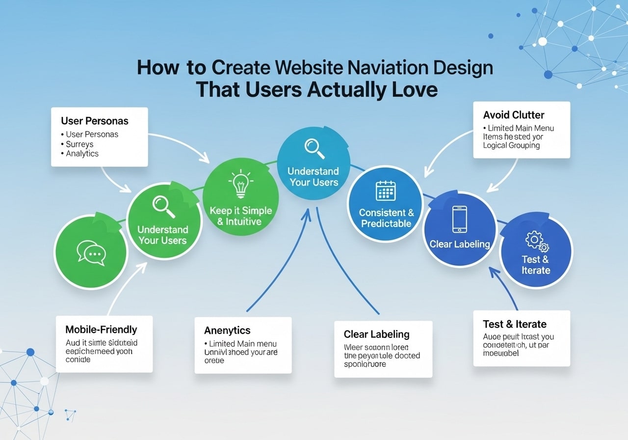
Good navigation design combines visual elements with smart information organization. Your website navigation structure should make it obvious where visitors can go and how to get there. This means using clear labels, logical groupings, and consistent placement throughout your site.
The main goal is simple: help users find what they need quickly and easily. When people can navigate your site without thinking too hard about it, they’re more likely to stick around, explore more pages, and take the actions you want them to take.
Why Good Navigation Design Matters
Your website navigation directly impacts user experience and business results. Here’s why it matters so much:
User Experience Impact
When visitors can easily find what they’re looking for, they have a better experience. Poor navigation leads to frustration, confusion, and high bounce rates. Good navigation keeps people engaged and helps them discover more of your content.
Search engines crawl your site using your navigation links. A clear website navigation hierarchy helps search engines understand your site structure and content relationships. This can improve your search rankings and help more people find your site.
Business Results
Better navigation leads to more page views, longer visit times, and higher conversion rates. When people can easily find your products, services, or contact information, they’re more likely to become customers.
Website Navigation Design Best Practices
Creating effective navigation requires following proven principles. These website navigation design best practices will help you build menus that work:
Keep It Simple and Clear
Use simple, descriptive labels that everyone can understand. Avoid industry jargon or creative terms that might confuse visitors. “Services” is better than “Solutions,” and “Contact” is clearer than “Get in Touch.”
Your main navigation should have 7 items or fewer. This follows the principle that people can only hold about 7 pieces of information in their short-term memory at once. If you have more content to organize, use dropdown menus or secondary navigation.
Make It Consistent
Your navigation should look and work the same way on every page. Use consistent styling, placement, and behavior. If your main menu is at the top of your homepage, it should be at the top of every other page too.
Use Visual Hierarchy
Make important navigation items stand out. You can do this with size, color, placement, or styling. Your most important pages should be easy to spot in your navigation.
Include Search Functionality
Not everyone navigates the same way. Some people prefer to search for what they want. Including a search box gives users another way to find content, especially on larger sites with lots of pages.
Design for Mobile First
More people browse websites on mobile devices than desktops. Your mobile website navigation design should work perfectly on small screens. This often means using hamburger menus, simple layouts, and touch-friendly buttons.
Types of Website Navigation Patterns
Different website navigation patterns work better for different types of sites. Here are the most common types:
Horizontal Navigation Bar
This is the classic navigation style you see at the top of most websites. It works well for sites with a moderate amount of main sections. The website navigation bar design typically includes your logo on the left and menu items spread across the top.
Hamburger Menu
Popular on mobile sites, the hamburger menu hides navigation items behind a three-line icon. Users click or tap the icon to reveal the full menu. This saves space but requires an extra click to access navigation.
Sidebar Navigation
Side navigation website design places the main menu in a vertical column, usually on the left side of the page. This works well for sites with many navigation options or complex hierarchies.
Footer Navigation
Footer navigation includes links at the bottom of your pages. This is great for secondary pages like privacy policies, terms of service, and contact information. It shouldn’t replace your main navigation but can supplement it.
Breadcrumb Navigation
Breadcrumbs show users where they are in your site hierarchy. They look like “Home > Products > Laptops > Gaming Laptops” and help users understand their location and navigate back to higher-level pages.
Mega Menus
For sites with lots of content, mega menus can display many options at once. When users hover over or click a main menu item, a large dropdown appears with multiple columns of links, images, and information.
Mobile Website Navigation Design
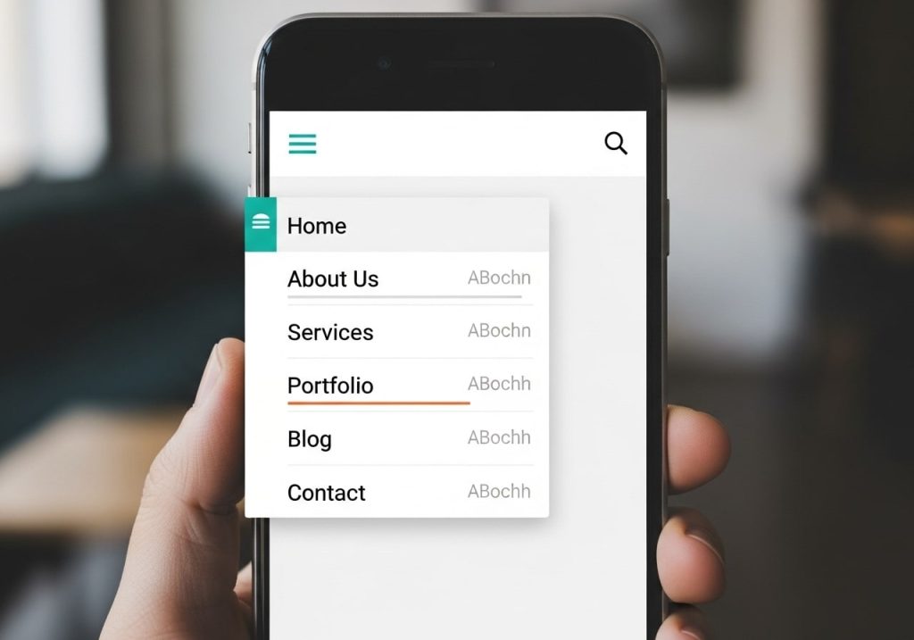
Mobile website navigation requires special consideration because of smaller screens and touch interfaces. Here are key principles:
Prioritize Important Items
Since mobile screens have limited space, you need to prioritize your most important navigation items. Consider what mobile users are most likely to want and make those items easily accessible.
Make Buttons Touch-Friendly
Mobile navigation buttons should be large enough to tap easily. Apple recommends a minimum of 44 pixels, while Google suggests 48 pixels for touch targets.
Use Progressive Disclosure
Instead of showing everything at once, reveal navigation options progressively. Start with main categories, then show subcategories when users tap on them.
Consider Thumb Navigation
Design your mobile navigation for thumb use. Place important items where they’re easy to reach with a thumb, typically in the middle and bottom portions of the screen.
Modern Website Navigation Design Examples
Looking at modern website navigation design examples can inspire your own design. Here are some trends in contemporary navigation:
Minimalist Designs
Many modern sites use clean, simple navigation with plenty of white space. This approach reduces visual clutter and makes it easier for users to focus on navigation options.
Sticky Navigation
Sticky or fixed navigation stays visible as users scroll down the page. This ensures that navigation is always accessible, no matter how far down the page someone scrolls.
Icon-Based Navigation
Some sites use icons alongside or instead of text labels. This can save space and create a more visual experience, but icons should be universally understood or accompanied by text labels.
Full-Screen Overlays
When activated, these navigation menus take over the entire screen. They’re popular for creating dramatic effects and giving plenty of space for navigation options.
Website Navigation Design Tools
Several website navigation design tools can help you create and prototype navigation systems:
Design Tools
Figma is excellent for designing navigation interfaces. It offers templates, components, and collaboration features that make it easy to create and iterate on navigation designs.
Sketch is another popular design tool with robust prototyping capabilities. You can create interactive navigation prototypes to test user flows.
Adobe XD provides design and prototyping features specifically for user experience design, including navigation systems.
Website Builders
WordPress offers thousands of themes with different navigation styles. You can also customize navigation using plugins and custom code.
Squarespace provides professional website navigation templates that you can customize to match your brand and content structure.
Wix includes drag-and-drop navigation building tools that make it easy to create custom navigation without coding.
Analytics Tools
Google Analytics helps you understand how users navigate your site. You can see which pages are most popular and where people tend to exit your site.
Hotjar provides heatmaps and user recordings that show exactly how people interact with your navigation. This data can reveal navigation problems you might not otherwise notice.
Common Navigation Design Mistakes
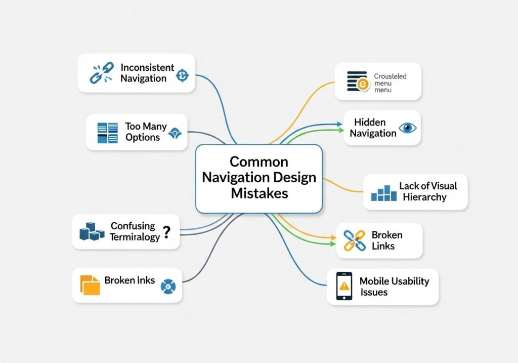
Avoiding bad website navigation design is just as important as implementing good practices. Here are mistakes to watch out for:
Using Unclear Labels
Vague or creative labels confuse users. “Solutions” could mean anything. “Web Design Services” is much clearer. Always choose clarity over creativity when labeling navigation items.
Having Too Many Options
When faced with too many choices, people often choose nothing at all. This is called choice paralysis. Keep your main navigation focused on the most important pages and use secondary menus for additional options.
Inconsistent Navigation
If your navigation changes between pages or works differently in different sections, users get confused. Maintain consistency in placement, styling, and behavior throughout your site.
Ignoring Mobile Users
Navigation that works on desktop but breaks on mobile will frustrate the majority of your visitors. Always test your navigation on various mobile devices and screen sizes.
Hidden or Hard-to-Find Navigation
Your navigation should be obvious and easy to find. If users have to hunt for it, you’ll lose them. Standard placement at the top of the page works because that’s where people expect to find it.
How to Design Your Website Navigation
Here’s a step-by-step approach to designing website navigation:
Step 1: Audit Your Content
Start by listing all the pages and sections you need to include in your navigation. Group related content together and identify your most important pages.
Step 2: Create a Site Map
Organize your content into a logical hierarchy. Your website navigation hierarchy should flow from general to specific, with main categories branching into subcategories.
Step 3: Choose Your Navigation Pattern
Based on your content structure and user needs, choose the navigation pattern that works best. Consider factors like the amount of content, your target audience, and device usage.
Step 4: Write Clear Labels
Create navigation labels that are descriptive and easy to understand. Use language that your target audience uses, not internal company terminology.
Step 5: Design the Visual Elements
Create the visual design for your navigation, including colors, fonts, spacing, and hover effects. Ensure it matches your overall site design and brand.
Step 6: Build and Test
Implement your navigation design and test it thoroughly. Check that all links work, the design looks good on different devices, and the navigation is easy to use.
Testing Your Navigation Design
Regular testing helps ensure your website navigation ux meets user needs:
User Testing
Watch real people use your website and pay attention to how they interact with your navigation. Do they hesitate? Click the wrong items? Get confused? This direct feedback is invaluable.
A/B Testing
Test different navigation designs with different groups of users. You might test different labels, layouts, or styles to see which performs better.
Analytics Review
Regularly check your website analytics to understand how people navigate your site. Look for pages with high exit rates or paths that suggest navigation confusion.
Heat Map Analysis
Heat mapping tools show where people click and how they move through your pages. This can reveal navigation problems and opportunities for improvement.
Creating excellent website navigation design takes time and testing, but it’s one of the most important investments you can make in your website’s success. Good navigation helps users find what they need, improves your search engine rankings, and ultimately drives better business results.
Remember that navigation design isn’t a one-time task. As your site grows and changes, your navigation should evolve too. Regular reviews and updates ensure your navigation continues to serve your users effectively.
What challenges have you faced with your website navigation? Consider conducting a navigation audit of your current site and implementing some of these website navigation design tips to improve your user experience.
FAQs
What makes website navigation design truly user-friendly?
User-friendly navigation is simple, predictable, and helps visitors find what they’re looking for quickly. The best navigation uses familiar terms that people actually search for, has a clean layout, and works well on both computers and phones. When users can figure out where to go without thinking too hard, you’ve got good navigation.
How many menu items should I include in my main navigation?
Stick to 5-7 main menu items at most. Too many choices confuse visitors and make them spend more time deciding where to click. If you have lots of content, group related pages under broader categories instead of listing everything in the main menu.
Should I use dropdown menus or keep everything in a single row?
Dropdown menus work great when you have subcategories, but keep them simple. Show all dropdown options on hover (for desktop) and make sure they’re easy to tap on mobile devices. If you only have a few pages, a single row of menu items often works better and feels cleaner.
What’s the best place to put my main navigation menu?
Put your main navigation at the top of your page, either in the header or just below it. Most people expect to find it there. You can also add a simplified version in your footer for easy access from the bottom of long pages.
How do I make navigation work well on mobile phones?
Use a hamburger menu (those three horizontal lines) to save space, but make sure it’s clearly visible. When someone taps it, the menu should open smoothly and be easy to read. Keep menu text large enough to tap comfortably, and don’t make people pinch to zoom.
What words should I use for my navigation labels?
Use words your visitors would actually say when describing what they want. Skip creative or clever names that might confuse people. Instead of “Solutions,” try “Services.” Instead of “Our Story,” use “About Us.” Test your labels with real people to see if they make sense.
How can I show users where they are on my website?
Add breadcrumb navigation (like Home > Services > Web Design) near the top of each page. Also, highlight the current page in your main menu with a different color or style. This helps people understand where they are and how they got there.
Should I include a search bar in my navigation?
Yes, especially if you have lots of content or products. Place the search bar in your header where people expect to find it. Make it big enough to be noticeable but not so large that it takes over your navigation area.
How do I organize pages that don’t fit in my main categories?
Create a logical hierarchy by grouping similar pages together. You might need secondary navigation menus for specific sections, or you can add links in your footer for less important pages like privacy policies or terms of service.
What’s the biggest mistake people make with website navigation?
The biggest mistake is making navigation too complicated or using terms that only make sense to the business owner. Many people also forget to test their navigation on mobile devices. Always remember that visitors should be able to find what they need in just a few clicks, without having to guess what your menu items mean.